
Text and Modifiers in SwiftUI
Text and Modifiers in SwiftUI
A cafe receipt needs a clear heading, secondary order information and an easy-to-find total. Use Text and modifiers to create that hierarchy without rendering words into an image.
Prerequisites: finish Getting Started and the Swift for Apps group. Open the verified CafeReceipt Xcode project, choose an installed iPhone simulator, and press Command-R. No account, network service or private user data is needed.
Describe the receipt with Text
Each Text creates a text view from a string. The receipt uses separate views because its heading, order number, item and total have different roles. SwiftUI describes the interface; you do not manually draw each letter or place it at a pixel coordinate.
Text("Morning Coffee")
Text("Order 104")
Text("Total: $4.50")
The price is a fixed teaching fixture. Production prices should use a numeric amount and appropriate currency formatting rather than assembling money strings by hand.
Use semantic typography and emphasis
font(.largeTitle) selects a semantic text style. bold() adds emphasis, while foregroundStyle(.secondary) reduces emphasis for supporting information. Semantic fonts adapt to the user’s text-size preference; fixed point sizes would need extra consideration.
Text("Morning Coffee").font(.largeTitle).bold()
Text("Order 104").font(.subheadline).foregroundStyle(.secondary)
Meaning should remain clear without relying only on color. The order number is secondary because of its role, while the total has both a label and stronger typography.
Read modifiers from the inside outward
Modifiers return modified views. Order can change the bounds affected by later modifiers. In the comparison below, the first background includes the padding; the second background sits directly behind the original text and the padding surrounds it.
Text("Total").padding(12).background(.yellow)
Text("Total").background(.yellow).padding(12)
The receipt uses fixedSize(horizontal: false, vertical: true) for its explanatory sentence so the text can grow vertically. It still wraps to the proposed width. Avoid forcing a single line for content that must remain readable at larger text sizes.
Read and run the complete example
Replace ContentView.swift with this complete source in the supplied project. The app entry point already presents ContentView(). Excerpts above illustrate individual ideas; this file is the exact source used for the verified build.
import SwiftUI

struct ContentView: View {
    var body: some View {
        VStack(alignment: .leading, spacing: 16) {
            Text("Morning Coffee").font(.largeTitle).bold()
            Text("Order 104").font(.subheadline).foregroundStyle(.secondary)
            Text("Oat latte").font(.body)
            Text("Total: $4.50").font(.title2).bold()
            Text("Thank you for visiting. Your drink will be ready at the counter.")
                .font(.body).fixedSize(horizontal: false, vertical: true)
        }
        .padding(24)
    }
}

#Preview { ContentView() }
The #Preview declaration supports the Xcode canvas. The screenshot below verifies a launched app, independently of whether your canvas is active.
Compare with the running app
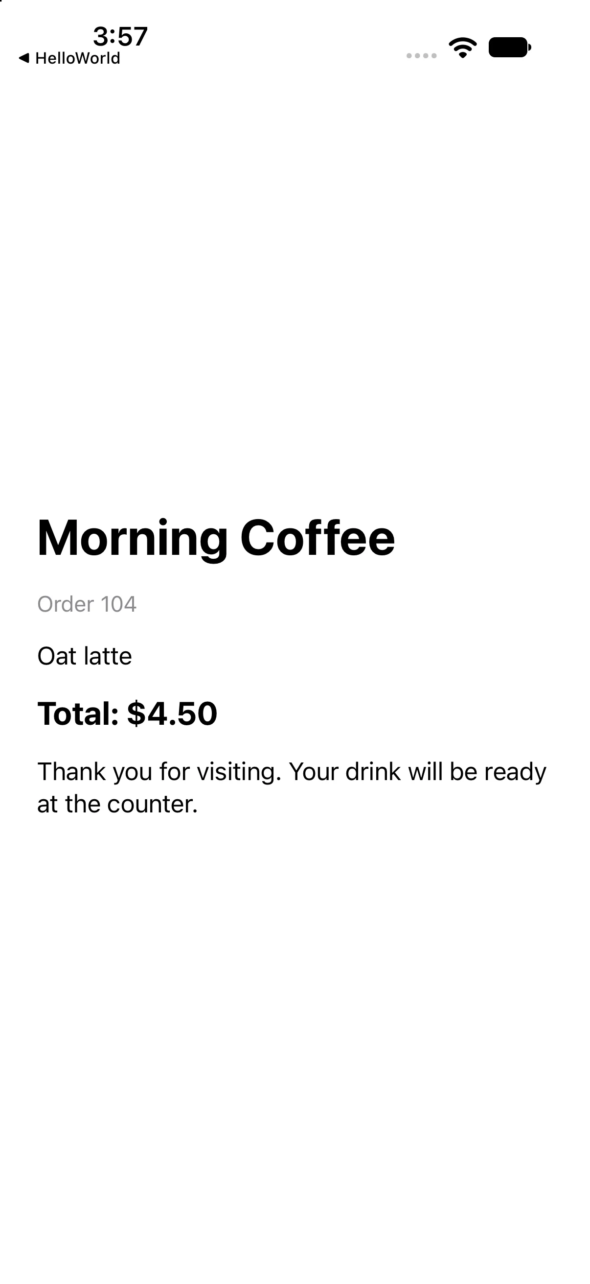
Morning Coffee, Order 104, Oat latte and Total: $4.50 appear with a clear typographic hierarchy.
This capture verifies the baseline on the named simulator. Also try a larger text size and another destination width; a baseline capture alone does not establish every accessibility or adaptive-layout case.
If your result differs
Old content: save ContentView.swift, confirm the selected scheme and destination, and run again. Incomplete snippet: use the complete source file rather than replacing the whole file with one excerpt. Layout crowding: check text size, available width, fixed frames and padding before adding arbitrary offsets. Read the first build diagnostic if compilation fails.
Make a receipt note readable at different lengths
A receipt’s order number can reasonably fit on one line, but its collection instructions may be essential. Applying lineLimit(1) to everything makes the layout compact by silently hiding information. Start by deciding which content may truncate and which must remain readable.
The comparison below uses the same long sentence twice. The first is intentionally constrained to one line; the second wraps. The lower pair then uses identical text with reversed padding/background order so the bounds affected by each modifier are visible. Compare the code and screenshot before copying either choice into the receipt.
Compare truncation, wrapping and modifier order
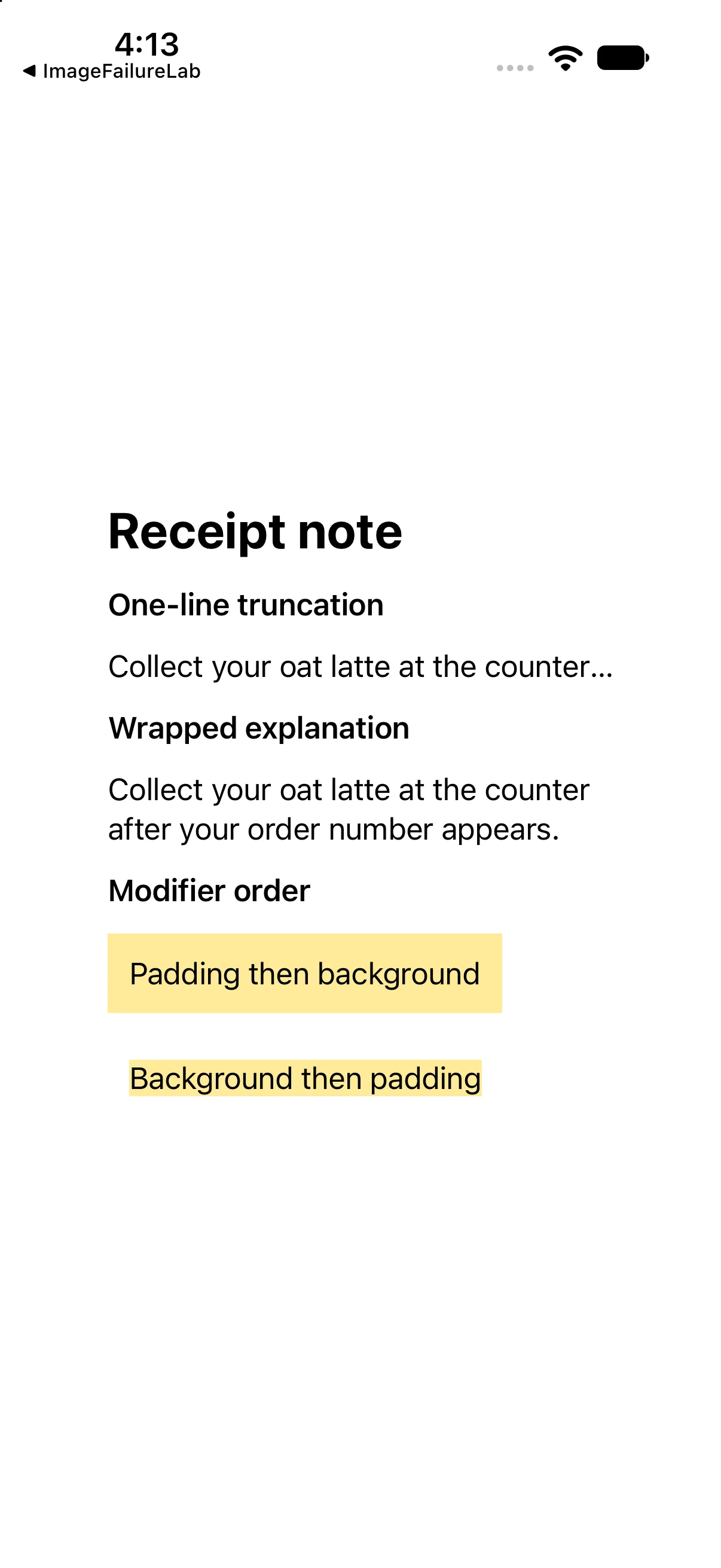
Run this separate comparison checkpoint. Its complete source and screenshot show the differences discussed immediately above; the earlier baseline project remains available.
import SwiftUI

struct ContentView: View {
 var body: some View {
 VStack(alignment: .leading, spacing: 14) {
 Text("Receipt note").font(.title).bold()
 Text("One-line truncation").font(.headline)
 Text("Collect your oat latte at the counter after your order number appears.")
   .lineLimit(1).truncationMode(.tail)
 Text("Wrapped explanation").font(.headline)
 Text("Collect your oat latte at the counter after your order number appears.")
   .fixedSize(horizontal: false, vertical: true)
 Text("Modifier order").font(.headline)
 Text("Padding then background").padding(12).background(.yellow.opacity(0.4))
 Text("Background then padding").background(.yellow.opacity(0.4)).padding(12)
}.frame(width: 290).padding(24)
 }
}

#Preview { ContentView() }
Download this complete checkpoint project. The code above replaces ContentView.swift in this project; its app entry point is already included.
Try a focused change
Change the item to Iced tea and the total to $3.25. Make the total a headline instead of title2. Predict which labels change and which styling remains.
Worked answer
Text("Iced tea").font(.body)
Text("Total: $3.25").font(.headline).bold()
Only those two text values and the total’s font style change. Restore the baseline to match the screenshot. Try a larger Dynamic Type size in Simulator and verify that the explanatory sentence wraps.
Check your understanding
Choose the explanation that matches this example.
What you learned
You created a readable receipt with semantic fonts, supporting text and deliberate modifier order. Next, add meaningful images and system symbols.
Reaching the recap and completing the quizzes are separate milestones.