
Images and SF Symbols in SwiftUI
Build images that fit the interface
You add a photograph to an app, give it a small frame, and discover that the photograph has not shrunk. Then you make it fill the card, and part of the subject disappears. These are different layout decisions, and understanding them is more useful than memorizing a chain of modifiers.
In this lesson you will add an actual image asset, diagnose native sizing, compare fit and fill, build a circular thumbnail and captioned card, then explore SF Symbol styling and accessibility. Each visual checkpoint includes its own runnable Xcode project and matching screenshot. Complete the project/assets and basic Swift lessons first.
The examples focus on bundled images and symbols. Remote image loading, photo selection and production caching are separate concerns; we explain their boundary at the end.
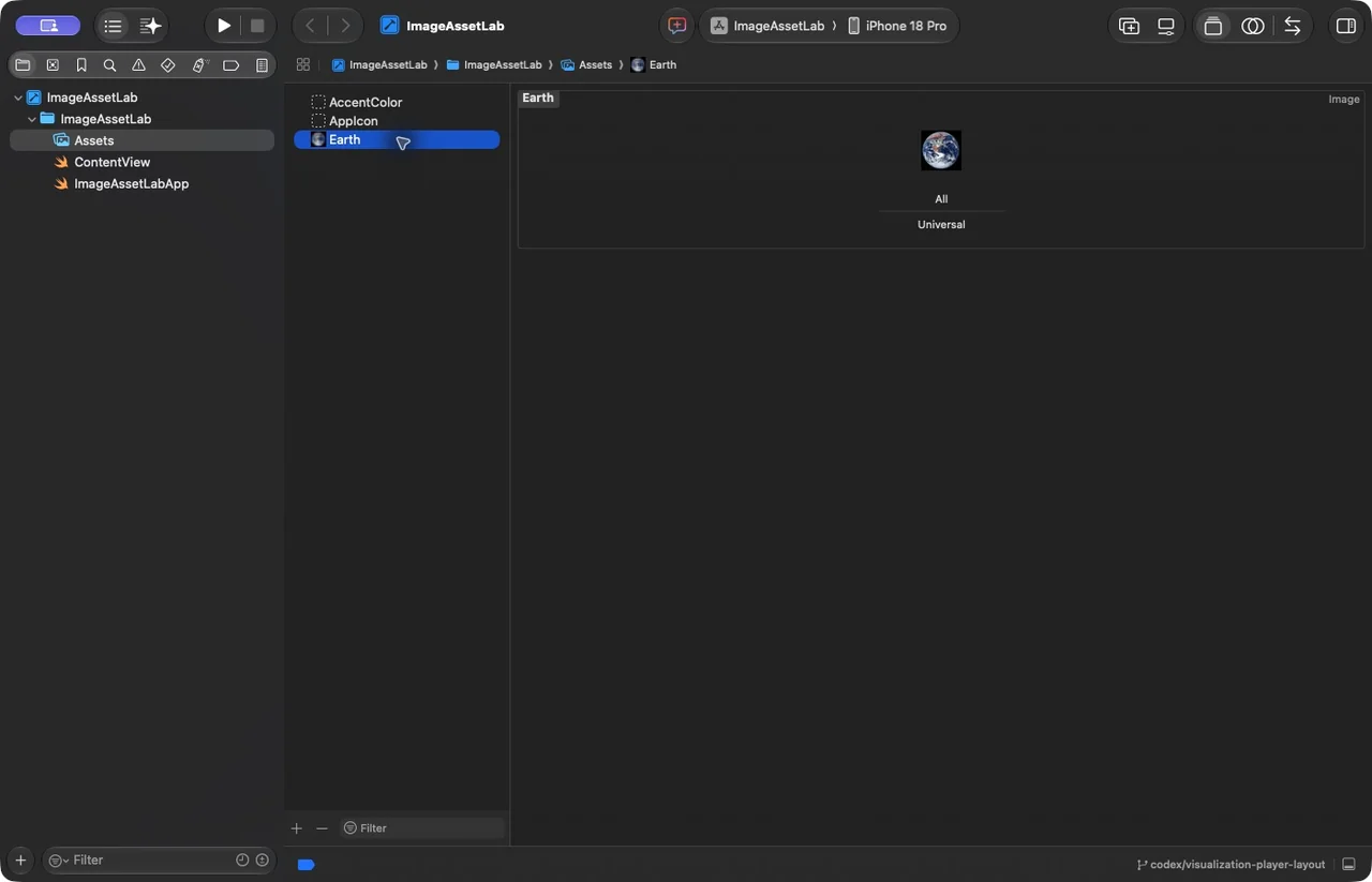
Add the Earth photograph to Assets.xcassets
Download the first checkpoint project below. It includes the actual JPEG and credit. To reproduce the setup yourself, create a SwiftUI iOS App project, open Assets.xcassets and add an Image Set with the exact name Earth. Drag earth.jpg from the download into its Universal image slot. If Xcode shows separate scale slots, use the image set’s inspector to select a single scale for this teaching asset.
The set name is the resource key; you do not write Image("earth.jpg") unless that is the actual resource name you arranged. Confirm that the catalog belongs to the app target. The downloadable catalog already contains this file structure:
Assets.xcassets/
  Earth.imageset/
    Contents.json
    earth.jpg
Why use a catalog? It organizes resources and can select appropriate variants, including appearance or device-specific variants. A filename in a folder is not automatically the same thing as a correctly configured named asset. After adding the set, build and inspect the image rather than treating a successful compilation as proof that the resource name resolves.
Photograph credit: NASA / Apollo 17 crew, Blue Marble. The downloadable projects include the image and source credit. This is a local photograph, not a remote URL and not an SF Symbol.
Display a real bundled photograph
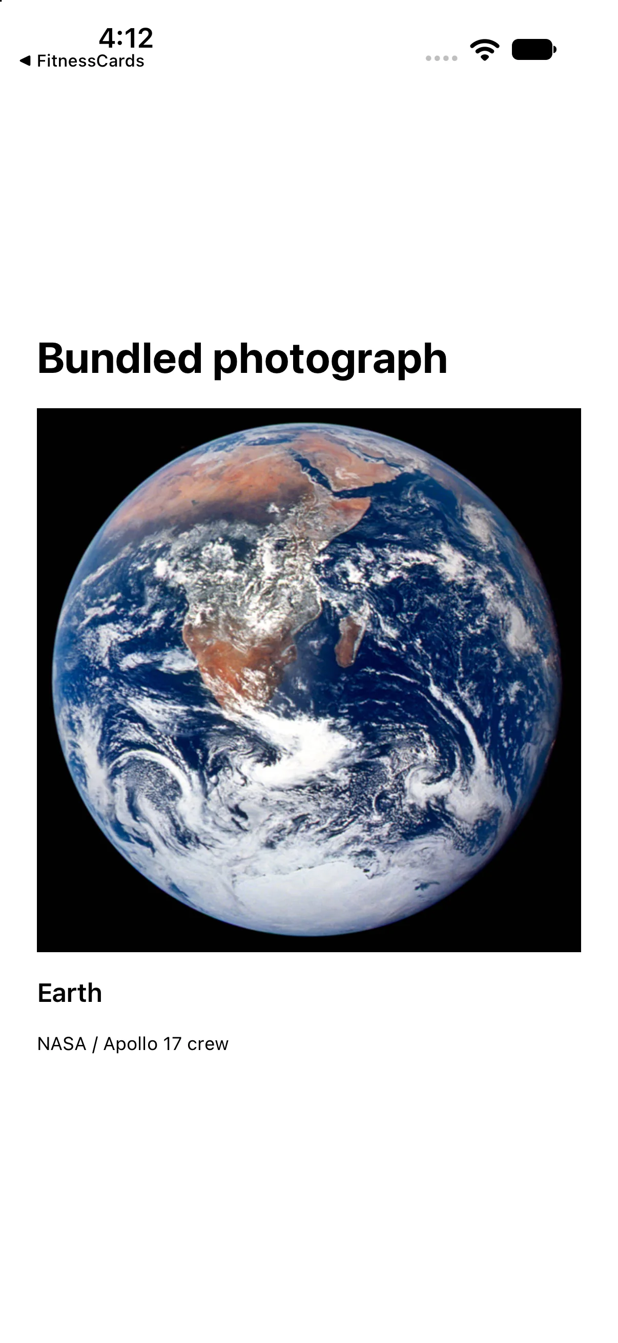
We will build a small Earth image card. Start with a photograph rather than a symbol: it has pixels, intrinsic dimensions and an aspect ratio that your layout must respect. The project bundles the NASA Apollo 17 photograph locally, so it works offline and requires no Photos permission.
Image("Earth") refers to the asset-set name. resizable() opts into resizing; scaledToFit() keeps the full photograph visible. The meaningful accessibility label describes the subject, while the credit identifies its source.
import SwiftUI

struct ContentView: View {
 var body: some View {
 VStack(alignment: .leading, spacing: 16) {
 Text("Bundled photograph").font(.title).bold()
 Image("Earth").resizable().scaledToFit().frame(maxWidth: .infinity)
   .accessibilityLabel("Earth photographed by the Apollo 17 crew")
 Text("Earth").font(.headline)
 Text("NASA / Apollo 17 crew").font(.caption)
}.padding(24)
 }
}

#Preview { ContentView() }
Download this complete checkpoint project. The code above replaces ContentView.swift in this project; its app entry point is already included.
Why did adding a frame crop my image?
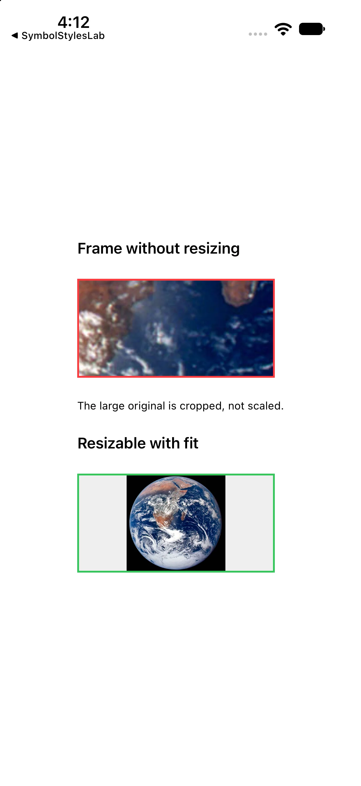
You want a small preview, so it is tempting to write Image("Earth").frame(width: 220, height: 110). A frame gives the image a layout wrapper; it does not make a non-resizable image shrink. The top example deliberately clips that large original to the frame, showing only a small part of it.
Compare the lower version. Adding resizable().scaledToFit() changes how the image fits the proposal. The green outline now contains the whole Earth, with spare horizontal room. The screenshot shows both cases at the same frame dimensions, so the visible difference has a specific cause.
import SwiftUI

struct ContentView: View {
 var body: some View {
 VStack(alignment: .leading, spacing: 24) {
 Text("Frame without resizing").font(.headline)
 Image("Earth").frame(width: 220, height: 110).clipped().border(.red, width: 2)
 Text("The large original is cropped, not scaled.").font(.caption)
 Text("Resizable with fit").font(.headline)
 Image("Earth").resizable().scaledToFit()
   .frame(width: 220, height: 110).background(.gray.opacity(0.15)).border(.green, width: 2)
}.padding(24)
 }
}

#Preview { ContentView() }
Download this complete checkpoint project. The code above replaces ContentView.swift in this project; its app entry point is already included.
Choose fit or fill for the same photograph
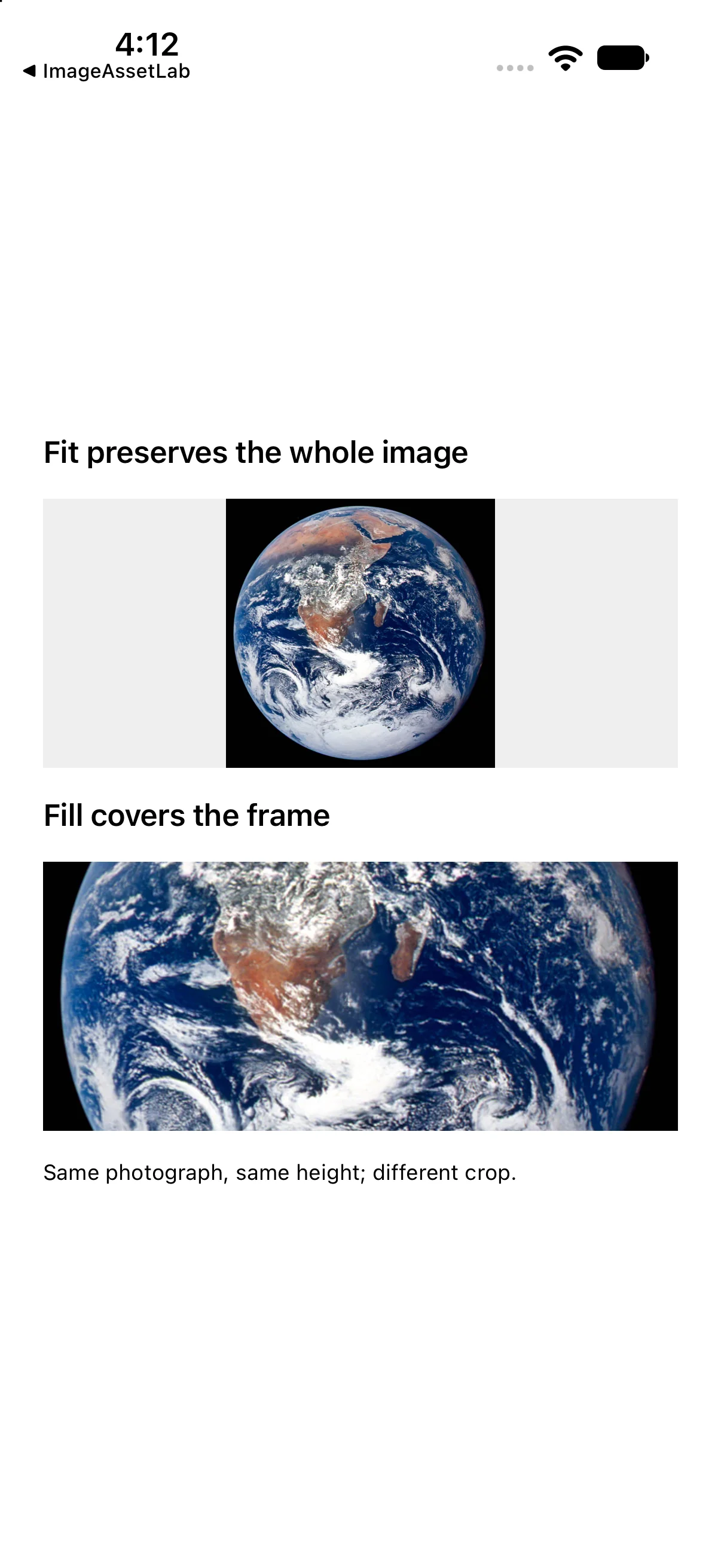
Now make a wide 150-point-high region. A square image cannot both fill this wide region and remain wholly visible without distortion. Fit preserves the whole subject and leaves spare space. Fill preserves proportions while covering the region, which means some content lies outside its bounds.
In the second version, clipped() discards the content outside the frame. It is a separate operation: scaledToFill() alone does not perform that crop. Keep the frame before clipped() so the clipping boundary is the intended card region. Choose fit for a product or diagram whose edges matter; choose fill when a consistent thumbnail shape matters more than preserving every edge.
import SwiftUI

struct ContentView: View {
 var body: some View {
 VStack(alignment: .leading, spacing: 16) {
 Text("Fit preserves the whole image").font(.headline)
 Image("Earth").resizable().scaledToFit()
   .frame(maxWidth: .infinity).frame(height: 150).background(.gray.opacity(0.15))
 Text("Fill covers the frame").font(.headline)
 Image("Earth").resizable().scaledToFill()
   .frame(maxWidth: .infinity).frame(height: 150).clipped()
 Text("Same photograph, same height; different crop.").font(.caption)
}.padding(24)
 }
}

#Preview { ContentView() }
Download this complete checkpoint project. The code above replaces ContentView.swift in this project; its app entry point is already included.
Turn the photograph into a thumbnail and captioned card
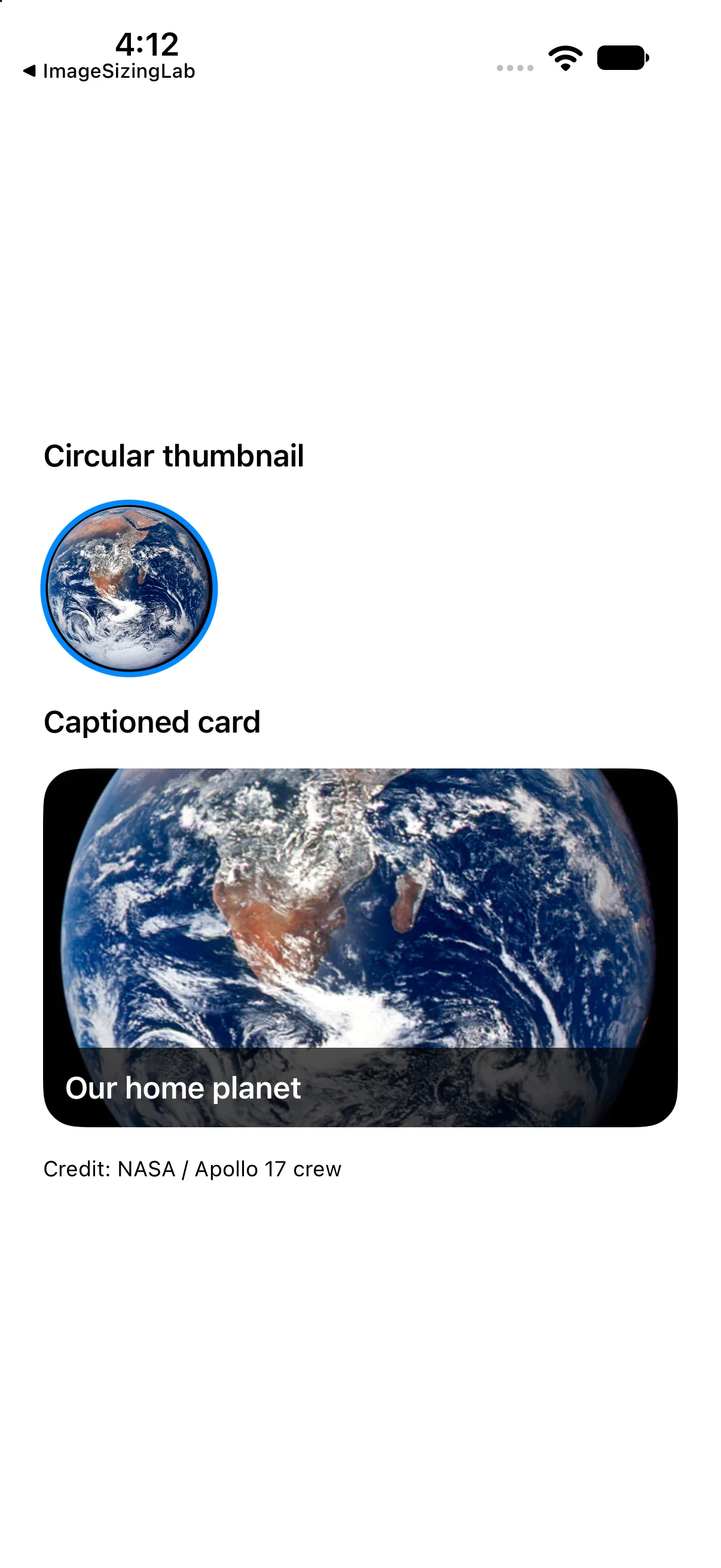
A circular thumbnail is a composition: resize proportionally to fill a square, give it a concrete size, then clip the result to a circle. The overlay draws a matching border. Making the frame rectangular first would change the shape and crop you are asking for.
The second example reuses the photograph in a wider card. A bottom-leading overlay places a caption over the photograph without changing the photo’s layout size. A dark backing makes the caption readable over this image; test contrast with the actual assets you intend to use. Finally, clipping the composition rounds both the image and its overlaid caption.
import SwiftUI

struct ContentView: View {
 var body: some View {
 VStack(alignment: .leading, spacing: 16) {
 Text("Circular thumbnail").font(.headline)
 Image("Earth").resizable().scaledToFill().frame(width: 96, height: 96)
   .clipShape(Circle()).overlay(Circle().stroke(.blue, lineWidth: 3))
 Text("Captioned card").font(.headline)
 Image("Earth").resizable().scaledToFill()
   .frame(maxWidth: .infinity).frame(height: 200).clipped()
   .overlay(alignment: .bottomLeading) {
     Text("Our home planet").font(.headline).foregroundStyle(.white)
       .padding(12).frame(maxWidth: .infinity, alignment: .leading)
       .background(.black.opacity(0.7))
   }
   .clipShape(RoundedRectangle(cornerRadius: 20))
 Text("Credit: NASA / Apollo 17 crew").font(.caption)
}.padding(24)
 }
}

#Preview { ContentView() }
Download this complete checkpoint project. The code above replaces ContentView.swift in this project; its app entry point is already included.
Size a symbol with text before reaching for a fixed frame
For an icon next to a label, start with font and imageScale. They express typographic size and relative symbol scale. A large standalone hero symbol may instead use resizable and a frame, as in the earlier weather example. These are different purposes.
Label("Clear skies", systemImage: "sun.max.fill")
    .font(.title2)
    .imageScale(.large)
    .foregroundStyle(.orange)
Apply symbol-specific modifiers while you still have the intended image or label in the composition. A bitmap photograph does not acquire SF Symbol layers because you apply a palette style. Likewise, imageScale is not a general-purpose photo-resizing API.
Treat SF Symbols as symbols, not photographs
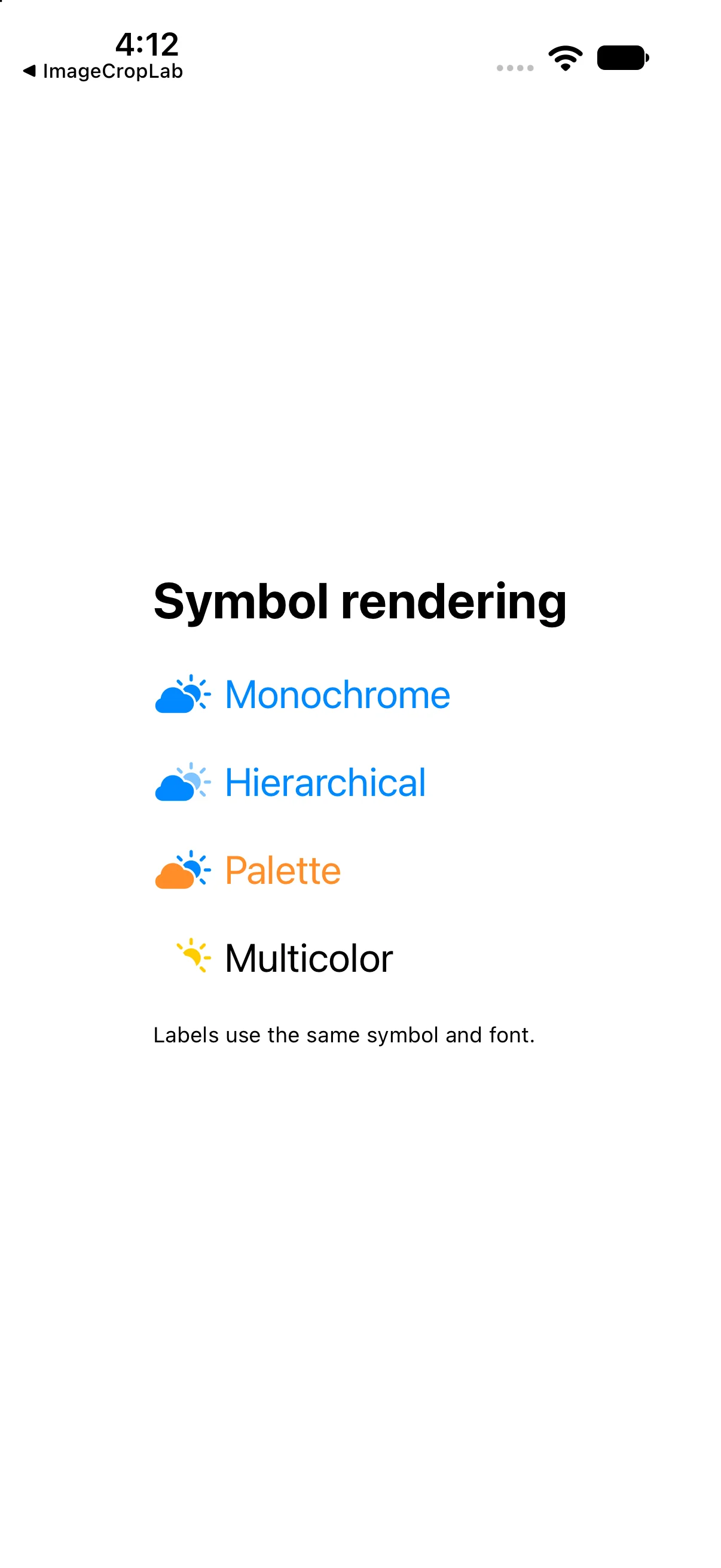
A photograph carries its own colors. A system symbol is designed to work with typography and supports symbol-specific rendering. Image(systemName:) requests that symbol; Image("Earth") requests your asset. Label combines a symbol with a title that remains meaningful when the icon alone is ambiguous.
These four rows deliberately keep the same cloud.sun.fill symbol and font. Monochrome uses one style. Hierarchical rendering derives visual levels from a style. Palette rendering supplies styles for the symbol’s supported layers. Multicolor asks for the symbol’s designed colors where supported. Not every symbol has every rendering behavior; inspect the symbol in the SF Symbols app and on your supported OS.
import SwiftUI

struct ContentView: View {
 var body: some View {
 VStack(alignment: .leading, spacing: 22) {
 Text("Symbol rendering").font(.title).bold()
 Label("Monochrome", systemImage: "cloud.sun.fill")
   .symbolRenderingMode(.monochrome).foregroundStyle(.blue)
 Label("Hierarchical", systemImage: "cloud.sun.fill")
   .symbolRenderingMode(.hierarchical).foregroundStyle(.blue)
 Label("Palette", systemImage: "cloud.sun.fill")
   .symbolRenderingMode(.palette).foregroundStyle(.orange, .blue)
 Label("Multicolor", systemImage: "cloud.sun.fill")
   .symbolRenderingMode(.multicolor)
 Text("Labels use the same symbol and font.").font(.caption)
}.font(.title2).padding(24)
 }
}

#Preview { ContentView() }
Download this complete checkpoint project. The code above replaces ContentView.swift in this project; its app entry point is already included.
Describe information; avoid announcing decoration twice
The Earth photograph is the subject of the first screen, so it has a descriptive accessibility label. A small decorative symbol beside an already descriptive title can be hidden from accessibility. Do not hide an image that communicates information absent from the text.
Image("Earth")
    .resizable().scaledToFit()
    .accessibilityLabel("Earth photographed by the Apollo 17 crew")

Image(systemName: "sun.max.fill")
    .accessibilityHidden(true)
Text("Clear skies")
For an icon-only button, name the action rather than the symbol’s shape. “Save article” is more useful than “bookmark rectangle.” Test the reading order and labels with VoiceOver; OCR verifies visible text, not screen-reader usability.
Make image decisions beyond the happy path
What if no image appears?
Check the exact asset-set name, that the slot actually contains image data, and that the catalog is in the built target. A missing image can yield a warning or empty result rather than a compiler error. For system symbols, check the spelling and availability for the minimum OS you support. If an optional name comes from data, validate it or provide an intentional fallback.
Why not ship every photo at full resolution?
Compressed download size and decoded memory are different. A 4000 × 3000 four-byte-per-pixel buffer is roughly 48 million bytes before additional overhead; a small on-screen thumbnail does not necessarily mean a small decoded source. Prepare appropriately sized assets, and use a suitable image-loading/downsampling pipeline for large or numerous images. These examples teach rendering, not a production memory cache.
When should a photograph be tinted?
Ordinary photographs should retain their colors. Template rendering is useful for single-color artwork, not for recoloring a full-color photo by accident. For decorative symbols, prefer semantic styles that remain readable in light and dark appearances.
Where does AsyncImage fit?
A remote URL introduces loading, success and failure states. AsyncImage can represent these phases, but the local asset examples here do not verify network behavior, retry policy, persistent caching or offline recovery. Build those deliberately in the networking group rather than replacing Image("Earth") with a URL and assuming the same guarantees.
Reference: Apple: Fitting images into available space and Image.
Design two uses of the same image
Use the downloaded Earth asset in two places: a wide educational detail image that must preserve the whole planet, and a 72-point circular list thumbnail. Before coding, decide whether each needs fit or fill and where clipping belongs.
Worked answer
Image("Earth")
    .resizable().scaledToFit()
    .frame(maxWidth: .infinity)

Image("Earth")
    .resizable().scaledToFill()
    .frame(width: 72, height: 72)
    .clipShape(Circle())
The detail uses fit because preserving all content is the requirement. The thumbnail fills its stable square bounds and then receives the circular mask. A square original may not show much crop in this particular thumbnail; repeat the experiment with a wide photograph to test the distinction. Explain what changes if you remove resizable or move clipping before the intended frame.
Check your sizing decision
Consider the same square photo in a wide rectangular card.
Choose the rendering behavior deliberately
You built with a real photograph, reproduced and fixed a sizing mistake, compared fit and fill, composed crops and captions, and separated image behavior from symbol rendering. You also identified resource, accessibility and memory questions that a final screenshot alone cannot answer. Next, use stacks to arrange those views into larger interfaces.
Reaching the recap and completing the quizzes are separate milestones.