
Buttons and Actions in SwiftUI
Buttons and Actions in SwiftUI
A reading screen needs a Save article action that becomes Remove bookmark after saving. The label must explain the action available now, and the status must explain what happened. Build that loop with a real Button rather than a tap gesture on decorative text.
You will learn: Separate a button’s action closure from its label; choose a meaningful control label; derive presentation from one Boolean; verify both directions of an interaction.
Prerequisites: the earlier SwiftUI Foundations lessons and Swift values/closures. These projects use the installed iOS SDK and local in-memory fixtures. They do not modify personal data or contact a server. The screenshot shows the initial screen before the interaction sequence.
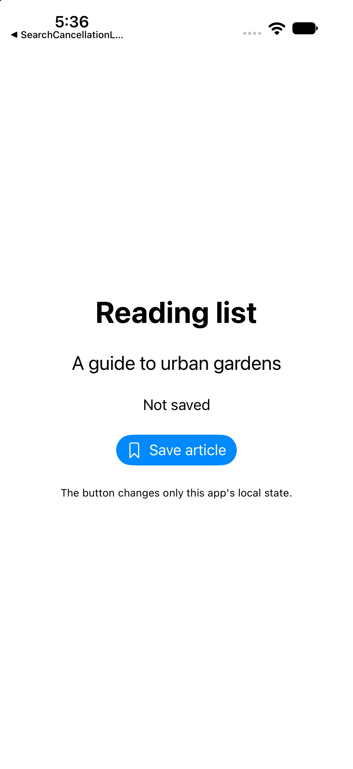
Describe the action and the label separately
A Button receives behavior and a view describing its label. SwiftUI evaluates the label while describing the screen; the action runs when the person activates the control. Passing a closure delays the work until activation. Calling a side-effecting operation while constructing body would be a different, usually incorrect, lifetime.
Button {
    saved.toggle()
} label: {
    Label(saved ? "Remove bookmark" : "Save article",
          systemImage: saved ? "bookmark.fill" : "bookmark")
}
The closure changes one source value. The label reads that value to describe the next possible action. Keeping behavior in a named Button also preserves standard control semantics for accessibility, keyboard and platform interaction, instead of re-creating them with Text.onTapGesture.
Use state to keep feedback consistent
The sample declares a small private @State Boolean. This is an early use of state; the next lesson develops ownership and lifetime in depth. Both the status and label derive from saved. Avoid storing three independently mutable values such as saved, statusText and buttonTitle when the latter two can be calculated from the first.
@State private var saved = false
// In body:
Text(saved ? "Saved to reading list" : "Not saved")
Otherwise a forgotten assignment can leave the screen saying Saved while the control still offers Save article. Deriving the presentation makes that inconsistent combination harder to express.
Style the control without changing its meaning
buttonStyle(.borderedProminent) emphasizes the primary action. Label combines a meaningful title with a symbol. The title names the action rather than the icon’s geometry; “Save article” is more useful than “Bookmark outline.” Avoid adding a second redundant accessibility label that merely repeats both pieces.
A role such as destructive expresses meaning, not just red coloring. Removing a sample bookmark here is a reversible local action; the destructive-confirmation example comes later. disabled should follow a real rule, and the operation itself must also validate important constraints if other code can invoke it.
Know what this example saves
This sample changes in-memory presentation state only. Closing and relaunching the process restores the initial value. It does not create a persistent reading list, write a database or contact a service. Later persistence lessons add those boundaries explicitly.
For an asynchronous save, model an in-progress state, prevent unintended duplicate requests and present failures with an actionable recovery path. Do not show a success message merely because a request started. This introductory example deliberately avoids those extra states so you can verify the action/label loop first.
Build the complete example
Download the ReadingButton Xcode project. Open ReadingButton.xcodeproj, select an installed compatible iPhone simulator, and run. The app entry point already presents ContentView. The complete ContentView.swift below is the exact built source; earlier snippets are explanatory excerpts.
import SwiftUI

struct ContentView: View {
@State private var saved = false
 var body: some View {
VStack(spacing: 24) {
 Text("Reading list").font(.largeTitle).bold()
 Text("A guide to urban gardens").font(.title2)
 Text(saved ? "Saved to reading list" : "Not saved").accessibilityIdentifier("saveStatus")
 Button { saved.toggle() } label: {
  Label(saved ? "Remove bookmark" : "Save article", systemImage: saved ? "bookmark.fill" : "bookmark")
 }.buttonStyle(.borderedProminent).accessibilityIdentifier("bookmarkAction")
 Text("The button changes only this app's local state.").font(.caption)
}.padding(24)
 }
}

#Preview { ContentView() }
Accessibility identifiers in the file provide stable names for local automation; they are not visible menu labels. #Preview is an editor convenience. The following screenshots come from the launched app after actual automated control interactions.
Save the article
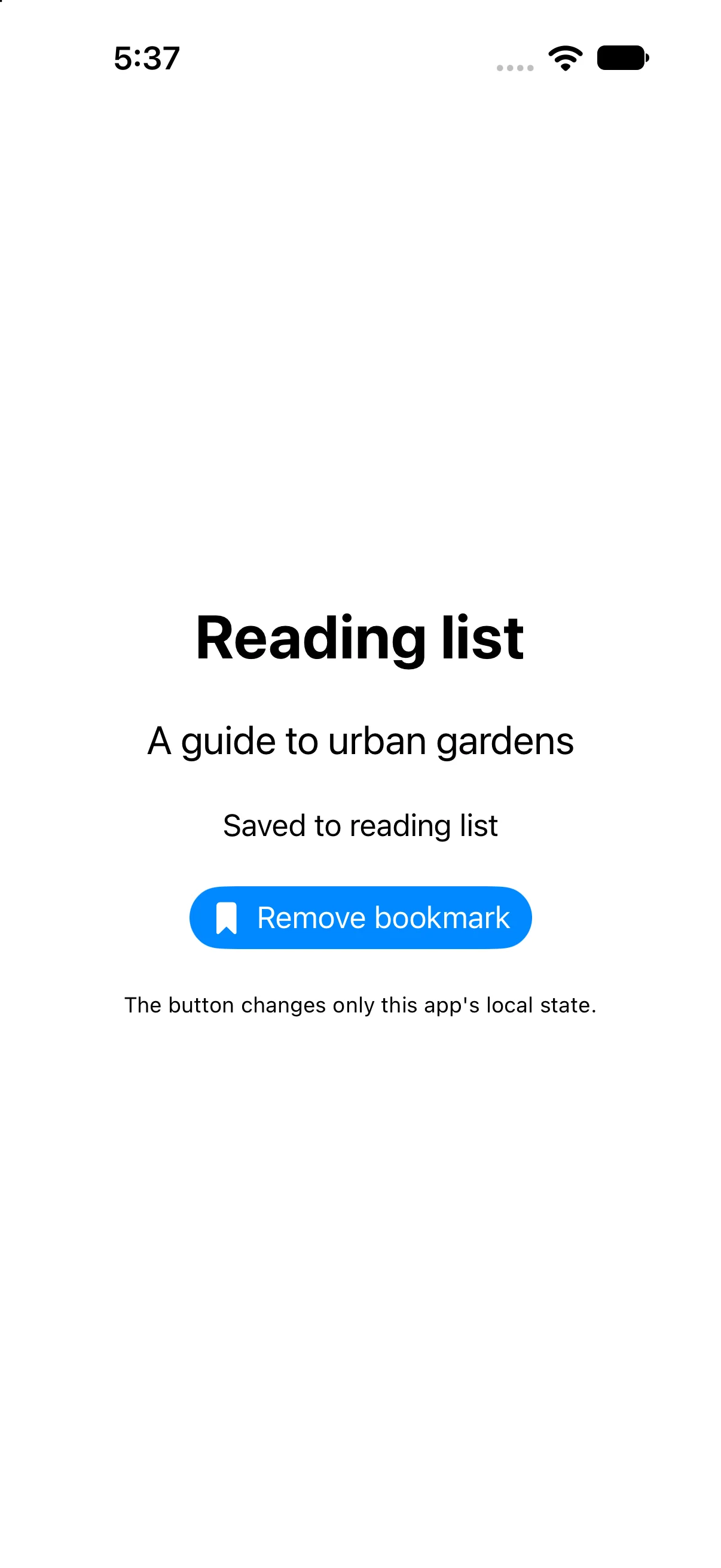
Activate Save article once. The observed status becomes Saved to reading list and the control now offers Remove bookmark. These are two presentations of the same changed Boolean, not two independently stored strings. The screenshot was captured after the automated button activation.
Remove the bookmark
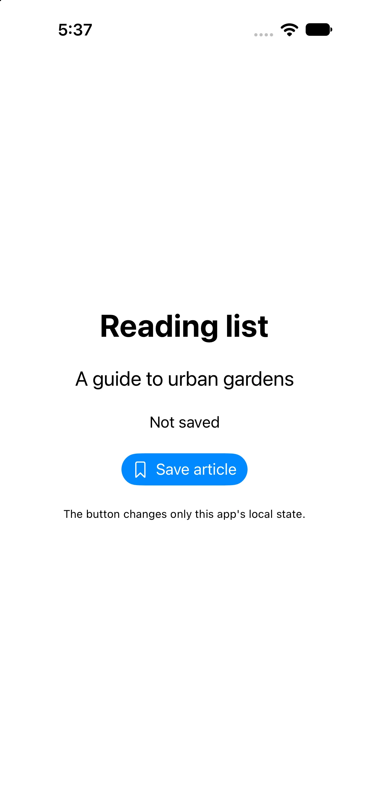
Activate the same control again. The observed status returns to Not saved and the label offers Save article. Testing the return path matters: a one-way example would not establish that the action and feedback stay synchronized.
Check a failure at the right boundary
If your output differs, compare the current input values and the relevant action before changing project settings. Save the complete source, confirm the selected scheme and destination, and inspect the first build diagnostic if compilation fails. A successful build establishes valid source; the action-result checks establish the particular UI transitions shown here.
Practice variations below are proposed changes, not additional captured states. Keep input validation, state ownership and presentation decisions explicit as you extend the project.
Try a new case and explain the result
Add a separate Clear button that always sets saved to false. Predict its effect before and after saving.
Worked answer
Button("Clear bookmark") { saved = false }
    .disabled(!saved)
Clear is an idempotent assignment: repeating it keeps the value false. toggle is different because repeating it reverses the value. The disabled modifier communicates that there is nothing to clear, while a direct assignment still expresses the operation safely.
Check your understanding
Choose the explanation that follows from the worked example.
What to take forward
You connected a semantic control to an action and consistent visible feedback, then verified both directions. Next, own changing values and derive a total with @State.
Reaching the recap and completing the quizzes are separate milestones.