
Stacks and Spacing in SwiftUI
Stacks and Spacing in SwiftUI
A delivery card combines an icon beside a two-line description and a status over a rounded background. Use nesting to express those relationships instead of assigning absolute screen coordinates.
Prerequisites: finish Getting Started and the Swift for Apps group. Open the verified DeliverySummary Xcode project, choose an installed iPhone simulator, and press Command-R. No account, network service or private user data is needed.
Choose a stack for each relationship
VStack arranges children vertically, HStack horizontally and ZStack layers them along the depth axis. The outer vertical stack separates the heading, delivery row, divider and status. The row itself contains a symbol and a nested vertical pair of labels.
HStack(alignment: .top, spacing: 16) {
    Image(systemName: "shippingbox.fill")
    VStack(alignment: .leading, spacing: 6) {
        Text("Arriving today")
        Text("2 items")
    }
    Spacer(minLength: 8)
}
Nested stacks express a small layout tree. The inner VStack controls the relationship between the labels; changing its spacing does not change the outer stack’s 24-point spacing.
Separate spacing, padding and flexible space
spacing is the gap between adjacent children of a stack. padding adds space around the modified view. Spacer consumes flexible room along a stack’s axis; its minLength provides a minimum rather than a fixed size.
Here the row’s trailing Spacer lets the symbol and description stay together toward the leading edge. Avoid adding repeated spaces inside strings to align labels; font metrics, screen widths and text sizes make that unreliable.
Layer a status over a background
Within the ZStack, the rounded rectangle is declared first and the status text afterward. Later children appear above earlier ones. The 80-point frame gives this teaching status region a predictable height.
ZStack {
    RoundedRectangle(cornerRadius: 16).fill(.blue.opacity(0.1))
    Text("On the way").font(.headline).padding()
}
.frame(height: 80)
A background modifier can also express this kind of relationship. Prefer the form that communicates ownership clearly. Check long text and larger text sizes before adopting a fixed-height region in a production interface.
Read and run the complete example
Replace ContentView.swift with this complete source in the supplied project. The app entry point already presents ContentView(). Excerpts above illustrate individual ideas; this file is the exact source used for the verified build.
import SwiftUI

struct ContentView: View {
    var body: some View {
        VStack(alignment: .leading, spacing: 24) {
            Text("Delivery").font(.largeTitle).bold()
            HStack(alignment: .top, spacing: 16) {
                Image(systemName: "shippingbox.fill")
                    .font(.largeTitle).foregroundStyle(.blue)
                    .accessibilityHidden(true)
                VStack(alignment: .leading, spacing: 6) {
                    Text("Arriving today").font(.headline)
                    Text("2 items").foregroundStyle(.secondary)
                }
                Spacer(minLength: 8)
            }
            Divider()
            ZStack {
                RoundedRectangle(cornerRadius: 16).fill(.blue.opacity(0.1))
                Text("On the way").font(.headline).padding()
            }
            .frame(height: 80)
        }
        .padding(24)
    }
}

#Preview { ContentView() }
The #Preview declaration supports the Xcode canvas. The screenshot below verifies a launched app, independently of whether your canvas is active.
Compare with the running app
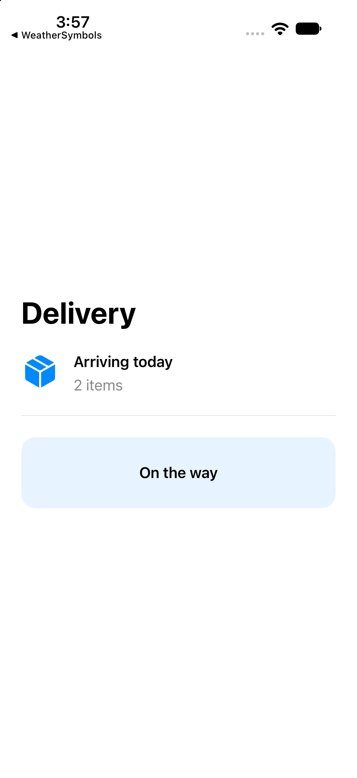
Delivery is followed by a box icon beside Arriving today and 2 items. A divider separates that row from the On the way status.
This capture verifies the baseline on the named simulator. Also try a larger text size and another destination width; a baseline capture alone does not establish every accessibility or adaptive-layout case.
If your result differs
Old content: save ContentView.swift, confirm the selected scheme and destination, and run again. Incomplete snippet: use the complete source file rather than replacing the whole file with one excerpt. Layout crowding: check text size, available width, fixed frames and padding before adding arbitrary offsets. Read the first build diagnostic if compilation fails.
Use flexible space to express a relationship
The label Parcel and its delivery date should be at opposite ends of a row. Simply increasing HStack spacing guesses a gap for one width. A Spacer describes the actual relationship: consume the remaining flexible horizontal room between the values.
The first row below intentionally has no flexible space; the second adds it. The last row aligns text baselines even though the number and unit have different font sizes. Baseline alignment is useful for text relationships; top or center alignment answers a different layout question.
Compare a fixed gap with flexible space
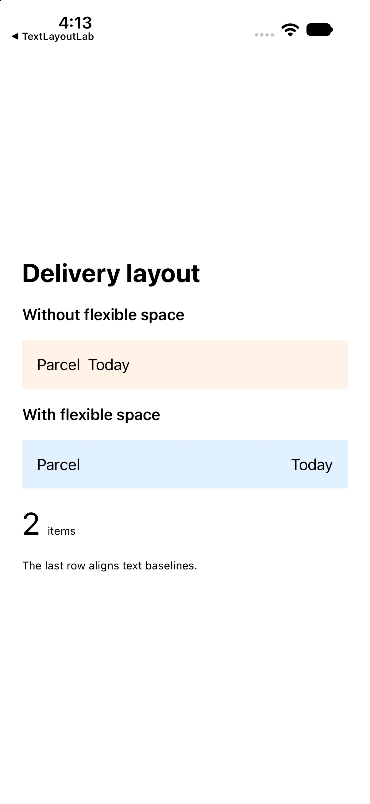
Run this separate comparison checkpoint. Its complete source and screenshot show the differences discussed immediately above; the earlier baseline project remains available.
import SwiftUI

struct ContentView: View {
 var body: some View {
 VStack(alignment: .leading, spacing: 18) {
 Text("Delivery layout").font(.title).bold()
 Text("Without flexible space").font(.headline)
 HStack { Text("Parcel"); Text("Today") }
   .padding().frame(maxWidth: .infinity, alignment: .leading).background(.orange.opacity(0.12))
 Text("With flexible space").font(.headline)
 HStack { Text("Parcel"); Spacer(minLength: 12); Text("Today") }
   .padding().background(.blue.opacity(0.12))
 HStack(alignment: .firstTextBaseline, spacing: 8) {
   Text("2").font(.largeTitle); Text("items").font(.caption)
 }.frame(maxWidth: .infinity, alignment: .leading)
 Text("The last row aligns text baselines.").font(.caption)
}.padding(24)
 }
}

#Preview { ContentView() }
Download this complete checkpoint project. The code above replaces ContentView.swift in this project; its app entry point is already included.
Try a focused change
Change the inner label spacing from 6 to 12 while leaving the outer spacing at 24. Predict the affected gap.
Worked answer
Only the gap between Arriving today and 2 items increases. Changing .padding(24) instead would affect the outside of the entire composition. Try a longer delivery description and check that the row remains readable at a narrow width.
Check your understanding
Choose the explanation that matches this example.
What you learned
You built a layout tree using three stack types and distinguished spacing, padding and flexible space. Next, control a view’s frame and alignment.
Reaching the recap and completing the quizzes are separate milestones.