
Frames and Alignment in SwiftUI
Frames and Alignment in SwiftUI
A boarding pass should align its gate and boarding time to the leading edge while placing the seat at the trailing edge. Use flexible frames to express that layout within the parent’s available width.
Prerequisites: finish Getting Started and the Swift for Apps group. Open the verified BoardingPass Xcode project, choose an installed iPhone simulator, and press Command-R. No account, network service or private user data is needed.
Think of a frame as a layout wrapper
A parent proposes space, and a child reports its size. A frame wraps a view and participates in that process; it does not rewrite the text’s contents. alignment specifies where the wrapped view sits inside the frame when there is extra room.
Text("Boarding 10:30")
    .frame(maxWidth: .infinity, alignment: .leading)
maxWidth: .infinity accepts available width from a finite parent; it does not ask for an infinitely wide screen. This example is inside a padded VStack with a finite screen proposal.
Use semantic edges
leading and trailing describe reading-direction-aware edges. The boarding time is leading-aligned, while Seat 14A is trailing-aligned. Text multiline alignment is a separate setting for lines inside a text view; it does not replace alignment of that view within a larger frame.
Text("Seat 14A").font(.headline)
    .frame(maxWidth: .infinity, alignment: .trailing)
Do not use offset to compensate for a misunderstood frame: offsets alter rendered placement without expressing the same layout relationship.
Apply the background to the intended bounds
The gate uses a minimum height rather than a fixed height, leaving room for content to grow. Padding follows the frame, and the background follows both, so the background covers the padded region.
Text("Gate B12").font(.title).bold()
    .frame(maxWidth: .infinity, minHeight: 100, alignment: .leading)
    .padding(16)
    .background(.blue.opacity(0.12), in: RoundedRectangle(cornerRadius: 16))
The resulting region includes the frame’s minimum height plus padding. A frame does not inherently clip overflowing content. Use clipping only when a crop is intentional, not to conceal text that should remain readable.
Read and run the complete example
Replace ContentView.swift with this complete source in the supplied project. The app entry point already presents ContentView(). Excerpts above illustrate individual ideas; this file is the exact source used for the verified build.
import SwiftUI

struct ContentView: View {
    var body: some View {
        VStack(spacing: 20) {
            Text("Boarding pass").font(.largeTitle).bold()
                .frame(maxWidth: .infinity, alignment: .leading)
            Text("Gate B12").font(.title).bold()
                .frame(maxWidth: .infinity, minHeight: 100, alignment: .leading)
                .padding(16)
                .background(.blue.opacity(0.12), in: RoundedRectangle(cornerRadius: 16))
            Text("Boarding 10:30")
                .frame(maxWidth: .infinity, alignment: .leading)
            Text("Seat 14A").font(.headline)
                .frame(maxWidth: .infinity, alignment: .trailing)
        }
        .padding(24)
    }
}

#Preview { ContentView() }
The #Preview declaration supports the Xcode canvas. The screenshot below verifies a launched app, independently of whether your canvas is active.
Compare with the running app
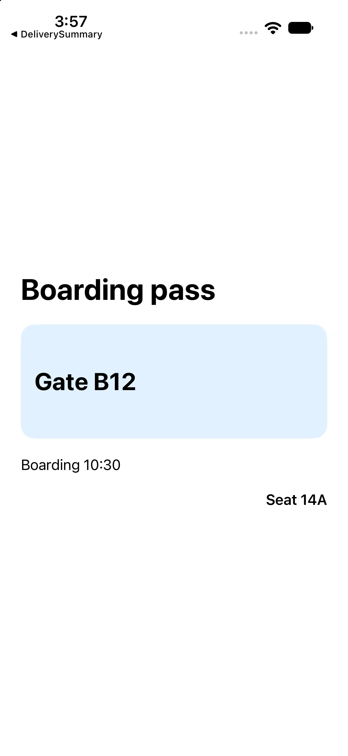
Boarding pass, Gate B12 and Boarding 10:30 align toward the leading edge. Seat 14A sits at the trailing edge beneath the highlighted gate region.
This capture verifies the baseline on the named simulator. Also try a larger text size and another destination width; a baseline capture alone does not establish every accessibility or adaptive-layout case.
If your result differs
Old content: save ContentView.swift, confirm the selected scheme and destination, and run again. Incomplete snippet: use the complete source file rather than replacing the whole file with one excerpt. Layout crowding: check text size, available width, fixed frames and padding before adding arbitrary offsets. Read the first build diagnostic if compilation fails.
See the content bounds and the frame bounds separately
It is difficult to learn frame alignment if every screenshot hides the boundaries. Add an orange border to the Text before expanding it, then a blue border after the frame. The orange border shows the text-sized content; blue shows the wrapper that can provide extra room.
Now leading and trailing become observable: the text stays small while its placement within the larger wrapper changes. Moving the border before or after a modifier changes which bounds you inspect, just as moving a background changes which region it paints.
Inspect text and wrapper bounds
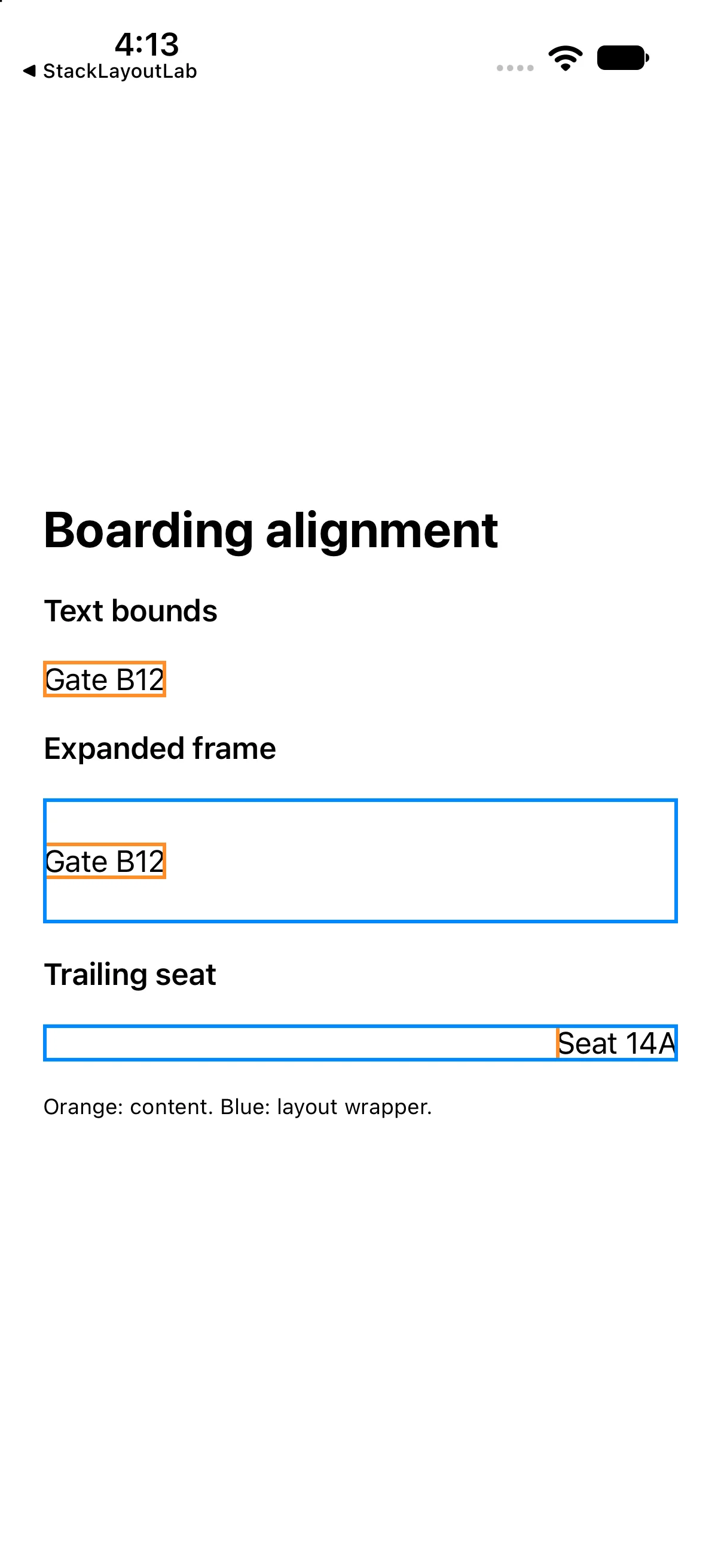
Run this separate comparison checkpoint. Its complete source and screenshot show the differences discussed immediately above; the earlier baseline project remains available.
import SwiftUI

struct ContentView: View {
 var body: some View {
 VStack(alignment: .leading, spacing: 18) {
 Text("Boarding alignment").font(.title).bold()
 Text("Text bounds").font(.headline)
 Text("Gate B12").border(.orange, width: 2)
 Text("Expanded frame").font(.headline)
 Text("Gate B12").border(.orange, width: 2)
   .frame(maxWidth: .infinity, minHeight: 70, alignment: .leading)
   .border(.blue, width: 2)
 Text("Trailing seat").font(.headline)
 Text("Seat 14A").border(.orange, width: 2)
   .frame(maxWidth: .infinity, alignment: .trailing).border(.blue, width: 2)
 Text("Orange: content. Blue: layout wrapper.").font(.caption)
}.padding(24)
 }
}

#Preview { ContentView() }
Download this complete checkpoint project. The code above replaces ContentView.swift in this project; its app entry point is already included.
Try a focused change
Center the seat label across the available width without adding spaces to its string.
Worked answer
Text("Seat 14A").font(.headline)
    .frame(maxWidth: .infinity, alignment: .center)
The label moves within its expanded frame. Its text and intrinsic typography remain unchanged. Also try a long gate label at a larger text size; the minimum-height region can grow.
Check your understanding
Choose the explanation that matches this example.
What you learned
You used a flexible width, semantic alignment and minimum height to structure a boarding pass. Next, extract a repeated interface into a reusable view.
Reaching the recap and completing the quizzes are separate milestones.