
Create Reusable Views in SwiftUI
Create Reusable Views in SwiftUI
A fitness summary repeats the same card layout for Walking and Cycling. Extract that layout into ActivityCard and pass each card its own title, duration and symbol.
Prerequisites: finish Getting Started and the Swift for Apps group. Open the verified FitnessCards Xcode project, choose an installed iPhone simulator, and press Command-R. No account, network service or private user data is needed.
Define the component’s inputs
ActivityCard conforms to View and has three immutable String inputs. Its body describes one card. Swift supplies the memberwise initializer used by the parent in this small struct.
struct ActivityCard: View {
    let title: String
    let duration: String
    let symbol: String
    // body appears in the complete source below.
}
This declaration is a teaching excerpt, not a complete standalone View: the complete source supplies body. Input properties are not locally owned interactive state. State and bindings follow in later lessons.
Create two instances from one definition
The parent passes different values to the same component. Reusing a view definition does not mean the two instances share one title or one duration.
ActivityCard(title: "Walking", duration: "30 minutes", symbol: "figure.walk")
ActivityCard(title: "Cycling", duration: "45 minutes", symbol: "bicycle")
If you change the card’s padding or typography, both instances gain that layout change. If you change only the second call’s duration, only the cycling card receives the new value.
Choose a useful component boundary
A card is a useful boundary because its layout and meaning repeat. Keep input names tied to that meaning. Avoid extracting every single Text into a component unless the abstraction provides a useful shared rule.
The decorative symbol is hidden from accessibility because the adjacent title already conveys the activity. The component uses flexible horizontal space rather than a hard-coded screen width. It can move to ActivityCard.swift later without changing its call sites; this small downloadable project keeps it in the same file for easy inspection.
Read and run the complete example
Replace ContentView.swift with this complete source in the supplied project. The app entry point already presents ContentView(). Excerpts above illustrate individual ideas; this file is the exact source used for the verified build.
import SwiftUI

struct ContentView: View {
    var body: some View {
        VStack(alignment: .leading, spacing: 16) {
            Text("Activity").font(.largeTitle).bold()
            ActivityCard(title: "Walking", duration: "30 minutes", symbol: "figure.walk")
            ActivityCard(title: "Cycling", duration: "45 minutes", symbol: "bicycle")
        }
        .padding(24)
    }
}

struct ActivityCard: View {
    let title: String
    let duration: String
    let symbol: String

    var body: some View {
        HStack(spacing: 16) {
            Image(systemName: symbol).font(.title).foregroundStyle(.blue)
                .accessibilityHidden(true)
            VStack(alignment: .leading, spacing: 4) {
                Text(title).font(.headline)
                Text(duration).foregroundStyle(.secondary)
            }
            Spacer(minLength: 8)
        }
        .padding(16)
        .background(.blue.opacity(0.08), in: RoundedRectangle(cornerRadius: 16))
    }
}

#Preview { ContentView() }
The #Preview declaration supports the Xcode canvas. The screenshot below verifies a launched app, independently of whether your canvas is active.
Compare with the running app
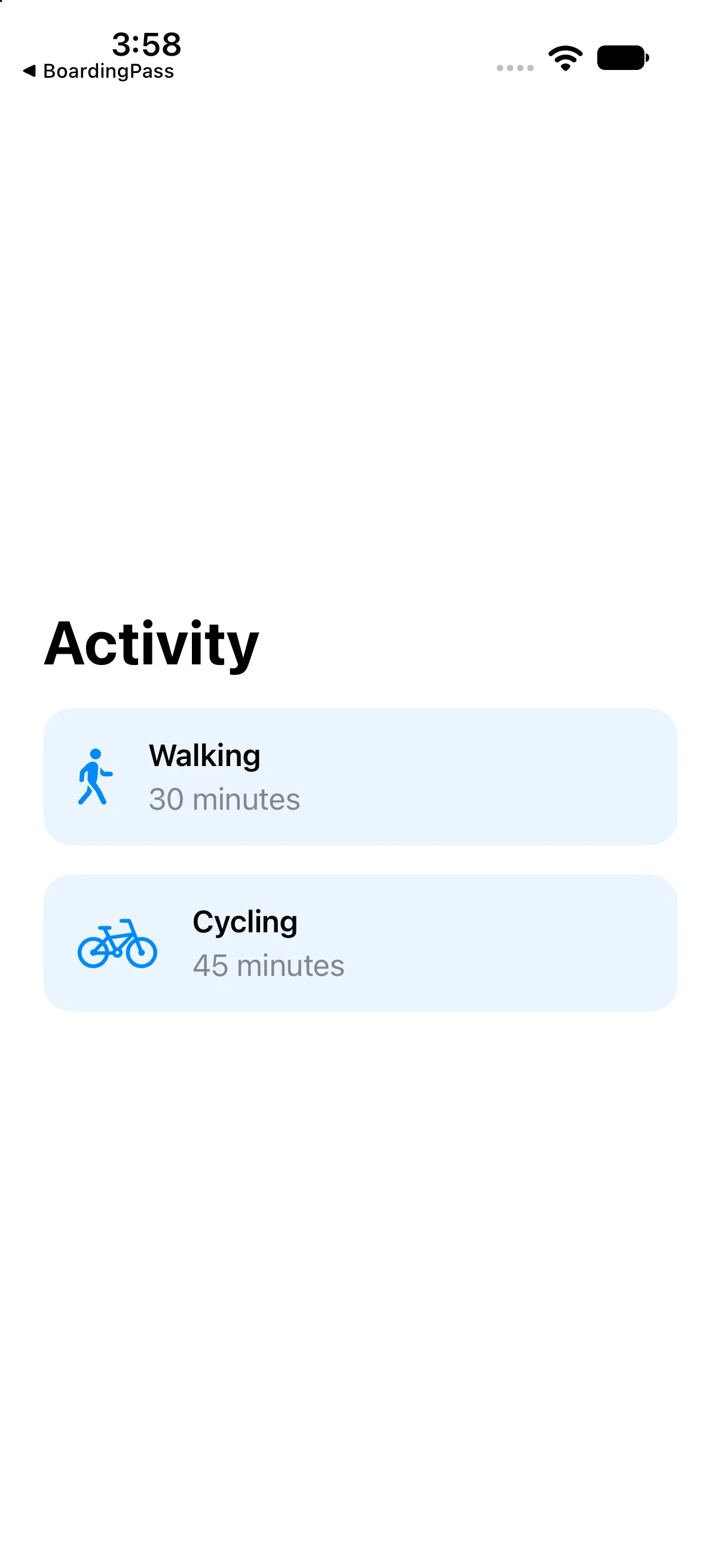
Activity appears above two consistently styled cards: Walking with 30 minutes, and Cycling with 45 minutes, each with its own symbol.
This capture verifies the baseline on the named simulator. Also try a larger text size and another destination width; a baseline capture alone does not establish every accessibility or adaptive-layout case.
If your result differs
Old content: save ContentView.swift, confirm the selected scheme and destination, and run again. Incomplete snippet: use the complete source file rather than replacing the whole file with one excerpt. Layout crowding: check text size, available width, fixed frames and padding before adding arbitrary offsets. Read the first build diagnostic if compilation fails.
Compose a third card without copying its implementation
A reusable view earns its abstraction when a meaningful repeated unit has independent input. The fitness row’s title, duration and symbol are data; its spacing, typography and background are shared presentation. Add Running by constructing another row rather than copying its HStack.
Notice the two different kinds of change: editing the component’s padding affects all rows, while editing one call’s duration affects only that instance. Keeping those decisions separate is a practical reason to extract the component before introducing more advanced ownership patterns.
Build a third independent activity row
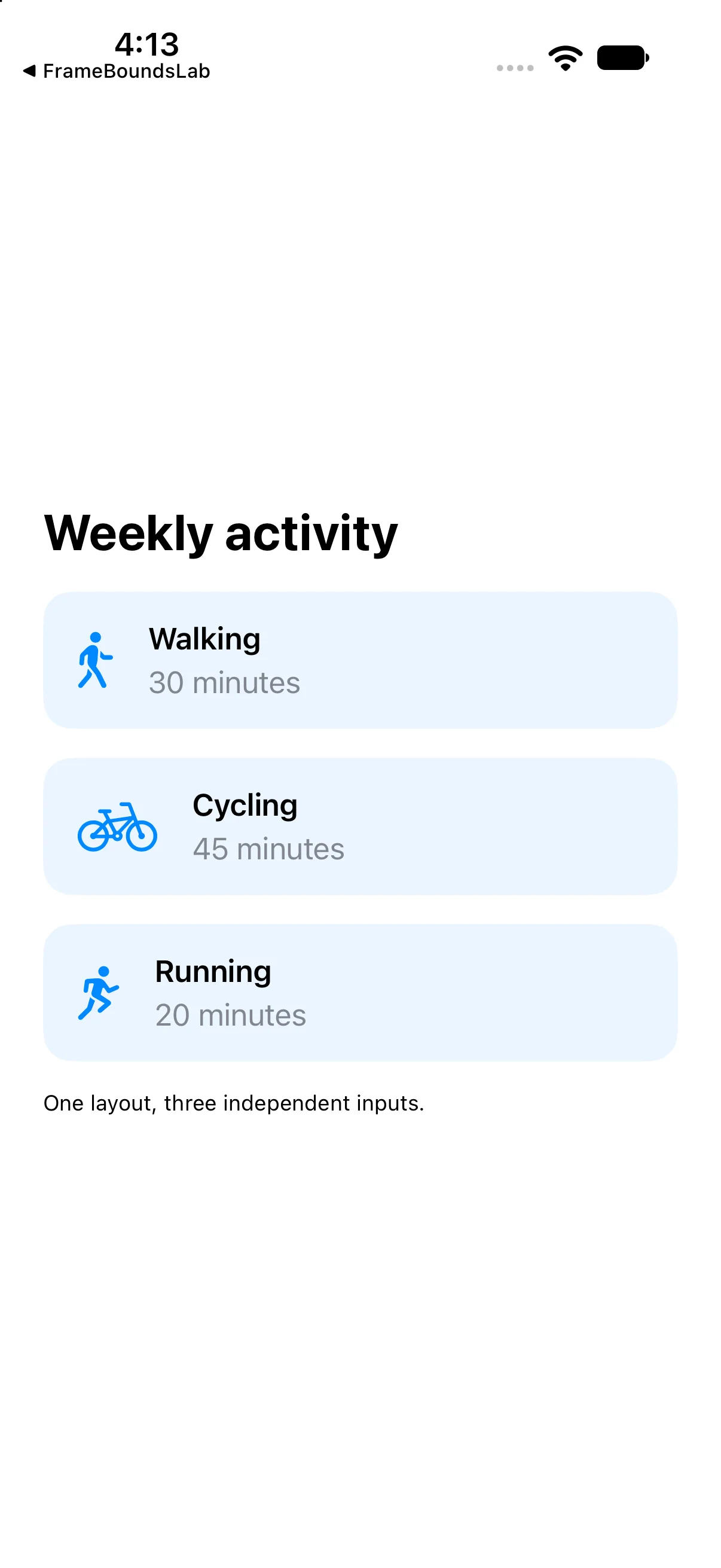
Run this separate comparison checkpoint. Its complete source and screenshot show the differences discussed immediately above; the earlier baseline project remains available.
import SwiftUI

struct ContentView: View {
 var body: some View {
 VStack(alignment: .leading, spacing: 16) {
 Text("Weekly activity").font(.title).bold()
 ActivityRow(title: "Walking", duration: "30 minutes", symbol: "figure.walk")
 ActivityRow(title: "Cycling", duration: "45 minutes", symbol: "bicycle")
 ActivityRow(title: "Running", duration: "20 minutes", symbol: "figure.run")
 Text("One layout, three independent inputs.").font(.caption)
}.padding(24)
 }
}

struct ActivityRow: View {
 let title: String
 let duration: String
 let symbol: String
 var body: some View {
  HStack(spacing: 16) {
   Image(systemName: symbol).font(.title).foregroundStyle(.blue).accessibilityHidden(true)
   VStack(alignment: .leading, spacing: 4) {
    Text(title).font(.headline)
    Text(duration).foregroundStyle(.secondary)
   }
   Spacer(minLength: 8)
  }.padding(16).background(.blue.opacity(0.08), in: RoundedRectangle(cornerRadius: 16))
 }
}

#Preview { ContentView() }
Download this complete checkpoint project. The code above replaces ContentView.swift in this project; its app entry point is already included.
Try a focused change
Add a third card for Running lasting 20 minutes, using figure.run. Do not duplicate the HStack implementation.
Worked answer
ActivityCard(title: "Running", duration: "20 minutes", symbol: "figure.run")The new call reuses the component. All three cards retain the same padding, typography and background. The verified baseline contains the first two cards. As the content grows, consider a scrolling container in the later list/layout lessons.
Check your understanding
Choose the explanation that matches this example.
What you learned
You extracted a meaningful component with explicit inputs and reused it without copying its layout. Next in the curriculum: buttons and actions, state, bindings, and forms.
Reaching the recap and completing the quizzes are separate milestones.