 ProgramGuru
The Floating Action Buttons (FAB) in Android Jetpack Compose are composable functions that provide various styles of floating buttons, typically used for primary and secondary actions in an application. This guide covers the four types of FABs: FloatingActionButton, SmallFloatingActionButton, LargeFloatingActionButton, and ExtendedFloatingActionButton.
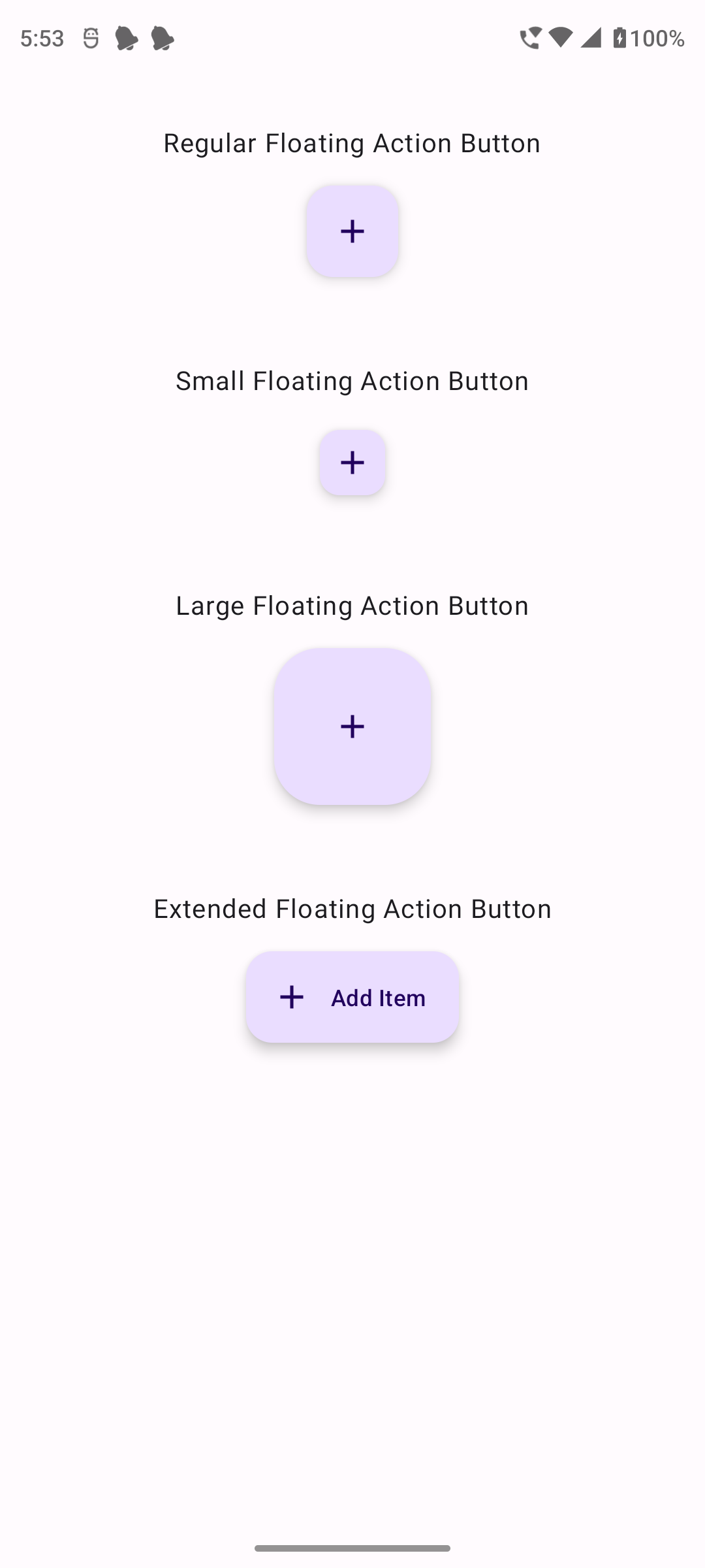
The following screenshot has all these four Floating Action Buttons, so that we get an idea of difference in size between them.
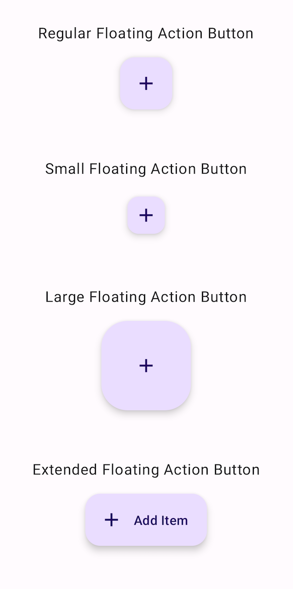
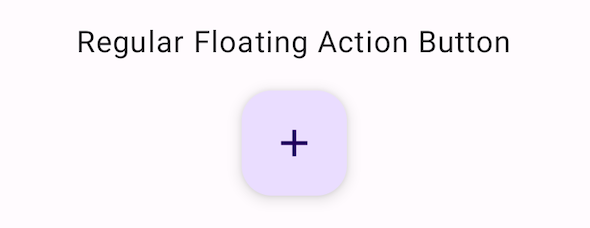
The FloatingActionButton is a standard floating button used for primary actions.
@Composable
fun BasicFloatingActionButtonExample() {
    FloatingActionButton(onClick = { /* Do something */ }) {
        Icon(Icons.Default.Add, contentDescription = "Add")
    }
}
This code creates a basic FloatingActionButton with an add icon. When clicked, it performs the action defined in the onClick lambda.
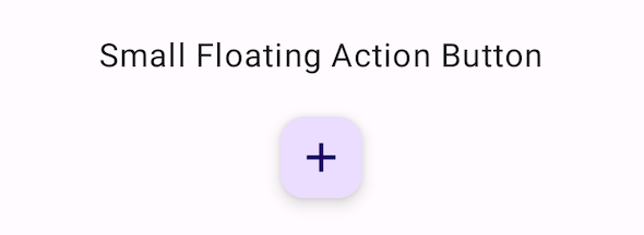
The SmallFloatingActionButton is a smaller version of the floating button, typically used for secondary actions.
@Composable
fun BasicSmallFloatingActionButtonExample() {
    SmallFloatingActionButton(onClick = { /* Do something */ }) {
        Icon(Icons.Default.Add, contentDescription = "Add")
    }
}
This code creates a basic SmallFloatingActionButton with an add icon. When clicked, it performs the action defined in the onClick lambda.
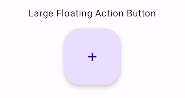
The LargeFloatingActionButton is a larger version of the floating button, typically used for prominent actions.
@Composable
fun BasicLargeFloatingActionButtonExample() {
    LargeFloatingActionButton(onClick = { /* Do something */ }) {
        Icon(Icons.Default.Add, contentDescription = "Add")
    }
}
This code creates a basic LargeFloatingActionButton with an add icon. When clicked, it performs the action defined in the onClick lambda.
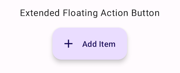
The ExtendedFloatingActionButton is an extended version of the floating button, allowing for both an icon and a text label.
@Composable
fun BasicExtendedFloatingActionButtonExample() {
    ExtendedFloatingActionButton(
        onClick = { /* Do something */ },
        icon = { Icon(Icons.Default.Add, contentDescription = "Add") },
        text = { Text("Add Item") }
    )
}
This code creates a basic ExtendedFloatingActionButton with an add icon and a text label "Add Item". When clicked, it performs the action defined in the onClick lambda.
package com.example.programguruapp
import android.os.Bundle
import androidx.activity.ComponentActivity
import androidx.activity.compose.setContent
import androidx.activity.enableEdgeToEdge
import androidx.compose.foundation.layout.Arrangement
import androidx.compose.foundation.layout.Column
import androidx.compose.foundation.layout.Spacer
import androidx.compose.foundation.layout.fillMaxSize
import androidx.compose.foundation.layout.fillMaxWidth
import androidx.compose.foundation.layout.padding
import androidx.compose.foundation.layout.size
import androidx.compose.foundation.shape.RoundedCornerShape
import androidx.compose.material.icons.Icons
import androidx.compose.material.icons.filled.Add
import androidx.compose.material.icons.filled.Edit
import androidx.compose.material.icons.filled.Home
import androidx.compose.material.icons.filled.Share
import androidx.compose.material3.FloatingActionButton
import androidx.compose.material3.SmallFloatingActionButton
import androidx.compose.material3.LargeFloatingActionButton
import androidx.compose.material3.ExtendedFloatingActionButton
import androidx.compose.material3.FloatingActionButtonDefaults
import androidx.compose.material3.Icon
import androidx.compose.material3.Scaffold
import androidx.compose.material3.Text
import androidx.compose.runtime.Composable
import androidx.compose.ui.Alignment
import androidx.compose.ui.Modifier
import androidx.compose.ui.graphics.Color
import androidx.compose.ui.unit.dp
import com.example.programguruapp.ui.theme.ProgramGuruAppTheme
class MainActivity : ComponentActivity() {
    override fun onCreate(savedInstanceState: Bundle?) {
        super.onCreate(savedInstanceState)
        enableEdgeToEdge()
        setContent {
            ProgramGuruAppTheme {
                Scaffold(modifier = Modifier.fillMaxSize()) {innerPadding ->
                    Column(
                        modifier = Modifier
                            .fillMaxWidth()
                            .padding(innerPadding),
                        verticalArrangement = Arrangement.spacedBy(16.dp),
                        horizontalAlignment = Alignment.CenterHorizontally
                    ) {
                        Spacer(modifier = Modifier.padding(10.dp))
                        Text(text = "Regular Floating Action Button")
                        BasicFloatingActionButtonExample()
                        Spacer(modifier = Modifier.padding(10.dp))
                        Text(text = "Small Floating Action Button")
                        BasicSmallFloatingActionButtonExample()
                        Spacer(modifier = Modifier.padding(10.dp))
                        Text(text = "Large Floating Action Button")
                        BasicLargeFloatingActionButtonExample()
                        Spacer(modifier = Modifier.padding(10.dp))
                        Text(text = "Extended Floating Action Button")
                        BasicExtendedFloatingActionButtonExample()
                    }
                }
            }
        }
    }
}
@Composable
fun BasicFloatingActionButtonExample() {
    FloatingActionButton(onClick = { /* Do something */ }) {
        Icon(Icons.Default.Add, contentDescription = "Add")
    }
}
@Composable
fun BasicSmallFloatingActionButtonExample() {
    SmallFloatingActionButton(onClick = { /* Do something */ }) {
        Icon(Icons.Default.Add, contentDescription = "Add")
    }
}
@Composable
fun BasicLargeFloatingActionButtonExample() {
    LargeFloatingActionButton(onClick = { /* Do something */ }) {
        Icon(Icons.Default.Add, contentDescription = "Add")
    }
}
@Composable
fun BasicExtendedFloatingActionButtonExample() {
    ExtendedFloatingActionButton(
        onClick = { /* Do something */ },
        icon = { Icon(Icons.Default.Add, contentDescription = "Add") },
        text = { Text("Add Item") }
    )
}
The Floating Action Buttons in Android Jetpack Compose are versatile and powerful tools for creating visually distinct interactive elements in your app's user interface. Understanding how to customize and use different types of Floating Action Buttons effectively can enhance the usability and aesthetics of your Android applications.