 ProgramGuru
The ExtendedFloatingActionButton in Android Jetpack Compose is a composable function that provides an extended version of the floating action button, allowing for both an icon and a text label, typically used for more descriptive actions in an application.
@Composable
fun BasicExtendedFloatingActionButtonExample() {
    ExtendedFloatingActionButton(
        onClick = { /* Do something */ },
        icon = { Icon(Icons.Default.Add, contentDescription = "Add") },
        text = { Text("Add Item") }
    )
}
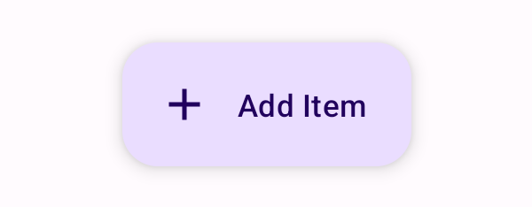
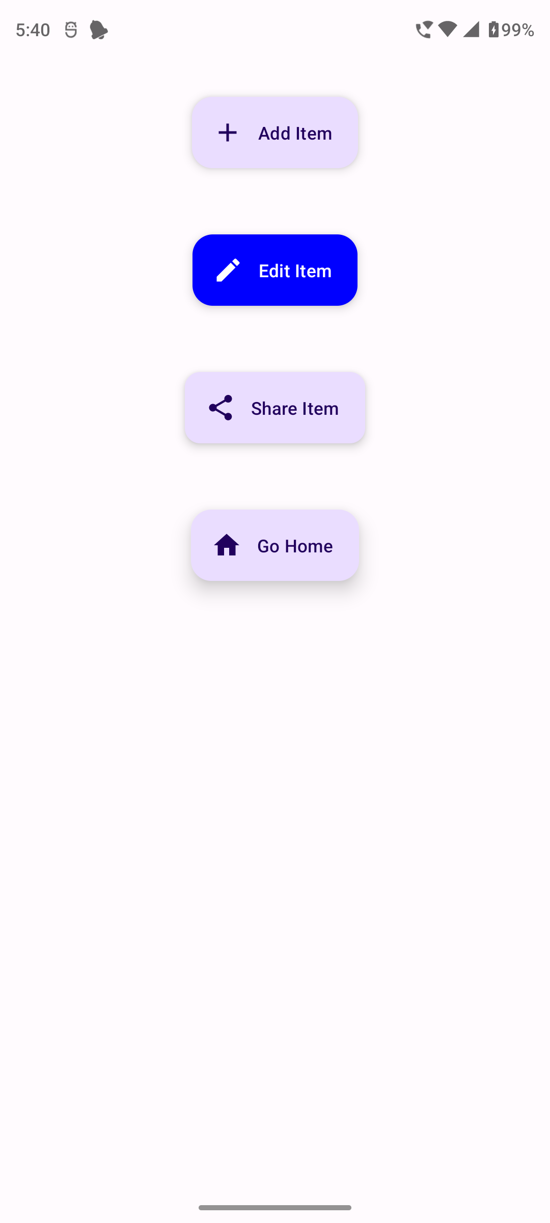
This code creates a basic ExtendedFloatingActionButton with an add icon and a text label "Add Item". When clicked, it performs the action defined in the onClick lambda.
@Composable
fun StyledExtendedFloatingActionButtonExample() {
    ExtendedFloatingActionButton(
        onClick = { /* Do something */ },
        icon = { Icon(Icons.Default.Edit, contentDescription = "Edit") },
        text = { Text("Edit Item") },
        containerColor = Color.Blue,
        contentColor = Color.White
    )
}
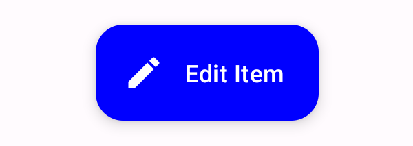
This code creates a styled ExtendedFloatingActionButton with a blue background, a white edit icon, and a text label "Edit Item".
@Composable
fun ShapedExtendedFloatingActionButtonExample() {
    ExtendedFloatingActionButton(
        onClick = { /* Do something */ },
        icon = { Icon(Icons.Default.Share, contentDescription = "Share") },
        text = { Text("Share Item") },
        shape = RoundedCornerShape(12.dp)
    )
}
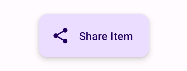
This code creates an ExtendedFloatingActionButton with rounded corners, a share icon, and a text label "Share Item".
@Composable
fun CustomElevationExtendedFloatingActionButtonExample() {
    ExtendedFloatingActionButton(
        onClick = { /* Do something */ },
        icon = { Icon(Icons.Default.Home, contentDescription = "Home") },
        text = { Text("Go Home") },
        elevation = FloatingActionButtonDefaults.elevation(defaultElevation = 12.dp)
    )
}
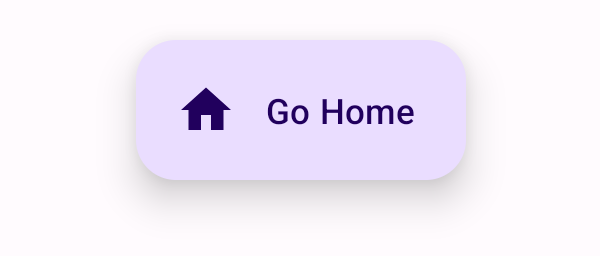
This code creates an ExtendedFloatingActionButton with a custom elevation of 12.dp, a home icon, and a text label "Go Home".
package com.example.programguruapp
import android.os.Bundle
import androidx.activity.ComponentActivity
import androidx.activity.compose.setContent
import androidx.activity.enableEdgeToEdge
import androidx.compose.foundation.layout.Arrangement
import androidx.compose.foundation.layout.Column
import androidx.compose.foundation.layout.Spacer
import androidx.compose.foundation.layout.fillMaxSize
import androidx.compose.foundation.layout.fillMaxWidth
import androidx.compose.foundation.layout.padding
import androidx.compose.foundation.layout.size
import androidx.compose.foundation.shape.RoundedCornerShape
import androidx.compose.material.icons.Icons
import androidx.compose.material.icons.filled.Add
import androidx.compose.material.icons.filled.Edit
import androidx.compose.material.icons.filled.Home
import androidx.compose.material.icons.filled.Share
import androidx.compose.material3.ExtendedFloatingActionButton
import androidx.compose.material3.FloatingActionButtonDefaults
import androidx.compose.material3.Icon
import androidx.compose.material3.Scaffold
import androidx.compose.material3.Text
import androidx.compose.runtime.Composable
import androidx.compose.ui.Alignment
import androidx.compose.ui.Modifier
import androidx.compose.ui.graphics.Color
import androidx.compose.ui.unit.dp
import com.example.programguruapp.ui.theme.ProgramGuruAppTheme
class MainActivity : ComponentActivity() {
    override fun onCreate(savedInstanceState: Bundle?) {
        super.onCreate(savedInstanceState)
        enableEdgeToEdge()
        setContent {
            ProgramGuruAppTheme {
                Scaffold(modifier = Modifier.fillMaxSize()) {innerPadding ->
                    Column(
                        modifier = Modifier
                            .fillMaxWidth()
                            .padding(innerPadding),
                        verticalArrangement = Arrangement.spacedBy(16.dp),
                        horizontalAlignment = Alignment.CenterHorizontally
                    ) {
                        Spacer(modifier = Modifier.padding(10.dp))
                        BasicExtendedFloatingActionButtonExample()
                        Spacer(modifier = Modifier.padding(10.dp))
                        StyledExtendedFloatingActionButtonExample()
                        Spacer(modifier = Modifier.padding(10.dp))
                        ShapedExtendedFloatingActionButtonExample()
                        Spacer(modifier = Modifier.padding(10.dp))
                        CustomElevationExtendedFloatingActionButtonExample()
                    }
                }
            }
        }
    }
}
@Composable
fun BasicExtendedFloatingActionButtonExample() {
    ExtendedFloatingActionButton(
        onClick = { /* Do something */ },
        icon = { Icon(Icons.Default.Add, contentDescription = "Add") },
        text = { Text("Add Item") }
    )
}
@Composable
fun StyledExtendedFloatingActionButtonExample() {
    ExtendedFloatingActionButton(
        onClick = { /* Do something */ },
        icon = { Icon(Icons.Default.Edit, contentDescription = "Edit") },
        text = { Text("Edit Item") },
        containerColor = Color.Blue,
        contentColor = Color.White
    )
}
@Composable
fun ShapedExtendedFloatingActionButtonExample() {
    ExtendedFloatingActionButton(
        onClick = { /* Do something */ },
        icon = { Icon(Icons.Default.Share, contentDescription = "Share") },
        text = { Text("Share Item") },
        shape = RoundedCornerShape(12.dp)
    )
}
@Composable
fun CustomElevationExtendedFloatingActionButtonExample() {
    ExtendedFloatingActionButton(
        onClick = { /* Do something */ },
        icon = { Icon(Icons.Default.Home, contentDescription = "Home") },
        text = { Text("Go Home") },
        elevation = FloatingActionButtonDefaults.elevation(defaultElevation = 12.dp)
    )
}
The ExtendedFloatingActionButton in Android Jetpack Compose is a versatile and powerful tool for creating visually distinct interactive elements in your app's user interface. Understanding how to customize and use ExtendedFloatingActionButtons effectively can enhance the usability and aesthetics of your Android applications.