 ProgramGuru
The ElevatedButton in Android Jetpack Compose is a composable function that allows you to create buttons with an elevated style, giving them a raised appearance while maintaining functionality for user interactions.
@Composable
fun BasicElevatedButtonExample() {
    ElevatedButton(onClick = { /* Do something */ }) {
        Text("Click Me")
    }
}
This code creates a basic ElevatedButton with the text "Click Me". When clicked, it performs the action defined in the onClick lambda.

@Composable
fun StyledElevatedButtonExample() {
    ElevatedButton(
        onClick = { /* Do something */ },
        colors = ButtonDefaults.elevatedButtonColors(containerColor = Color.Red)
    ) {
        Text("Styled Button", color = Color.White)
    }
}
This code creates a styled ElevatedButton with a red background and white text.

@Composable
fun IconElevatedButtonExample() {
    ElevatedButton(onClick = { /* Do something */ }) {
        Icon(Icons.Default.Star, contentDescription = null)
        Spacer(modifier = Modifier.size(ButtonDefaults.IconSpacing))
        Text("Favorite")
    }
}
This code creates an ElevatedButton with an icon (a star) and text next to it.

@Composable
fun ShapedElevatedButtonExample() {
    ElevatedButton(
        onClick = { /* Do something */ },
        shape = RoundedCornerShape(12.dp)
    ) {
        Text("Rounded Button")
    }
}
This code creates an ElevatedButton with rounded corners.

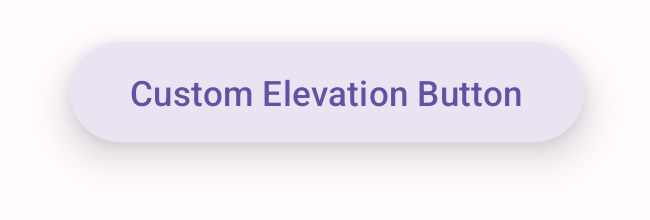
@Composable
fun CustomElevatedButtonExample() {
    ElevatedButton(
        onClick = { /* Do something */ },
        elevation = ButtonDefaults.buttonElevation(defaultElevation = 12.dp)
    ) {
        Text("Custom Elevation Button")
    }
}
This code creates an ElevatedButton with a custom elevation of 12.dp, giving it a more pronounced raised appearance.
package com.example.programguruapp
import android.os.Bundle
import androidx.activity.ComponentActivity
import androidx.activity.compose.setContent
import androidx.activity.enableEdgeToEdge
import androidx.compose.foundation.layout.Arrangement
import androidx.compose.foundation.layout.Column
import androidx.compose.foundation.layout.Spacer
import androidx.compose.foundation.layout.fillMaxSize
import androidx.compose.foundation.layout.fillMaxWidth
import androidx.compose.foundation.layout.padding
import androidx.compose.foundation.layout.size
import androidx.compose.foundation.shape.RoundedCornerShape
import androidx.compose.material.icons.Icons
import androidx.compose.material.icons.filled.Star
import androidx.compose.material3.ElevatedButton
import androidx.compose.material3.ButtonDefaults
import androidx.compose.material3.Icon
import androidx.compose.material3.Scaffold
import androidx.compose.material3.Text
import androidx.compose.runtime.Composable
import androidx.compose.ui.Alignment
import androidx.compose.ui.Modifier
import androidx.compose.ui.graphics.Color
import androidx.compose.ui.unit.dp
import com.example.programguruapp.ui.theme.ProgramGuruAppTheme
class MainActivity : ComponentActivity() {
    override fun onCreate(savedInstanceState: Bundle?) {
        super.onCreate(savedInstanceState)
        enableEdgeToEdge()
        setContent {
            ProgramGuruAppTheme {
                Scaffold(modifier = Modifier.fillMaxSize()) {innerPadding ->
                    Column(
                        modifier = Modifier
                            .fillMaxWidth()
                            .padding(innerPadding),
                        verticalArrangement = Arrangement.spacedBy(16.dp),
                        horizontalAlignment = Alignment.CenterHorizontally
                    ) {
                        BasicElevatedButtonExample()
                        StyledElevatedButtonExample()
                        IconElevatedButtonExample()
                        ShapedElevatedButtonExample()
                        CustomElevatedButtonExample()
                    }
                }
            }
        }
    }
}
@Composable
fun BasicElevatedButtonExample() {
    ElevatedButton(onClick = { /* Do something */ }) {
        Text("Click Me")
    }
}
@Composable
fun StyledElevatedButtonExample() {
    ElevatedButton(
        onClick = { /* Do something */ },
        colors = ButtonDefaults.elevatedButtonColors(containerColor = Color.Red)
    ) {
        Text("Styled Button", color = Color.White)
    }
}
@Composable
fun IconElevatedButtonExample() {
    ElevatedButton(onClick = { /* Do something */ }) {
        Icon(Icons.Default.Star, contentDescription = null)
        Spacer(modifier = Modifier.size(ButtonDefaults.IconSpacing))
        Text("Favorite")
    }
}
@Composable
fun ShapedElevatedButtonExample() {
    ElevatedButton(
        onClick = { /* Do something */ },
        shape = RoundedCornerShape(12.dp)
    ) {
        Text("Rounded Button")
    }
}
@Composable
fun CustomElevatedButtonExample() {
    ElevatedButton(
        onClick = { /* Do something */ },
        elevation = ButtonDefaults.buttonElevation(defaultElevation = 12.dp)
    ) {
        Text("Custom Elevation Button")
    }
}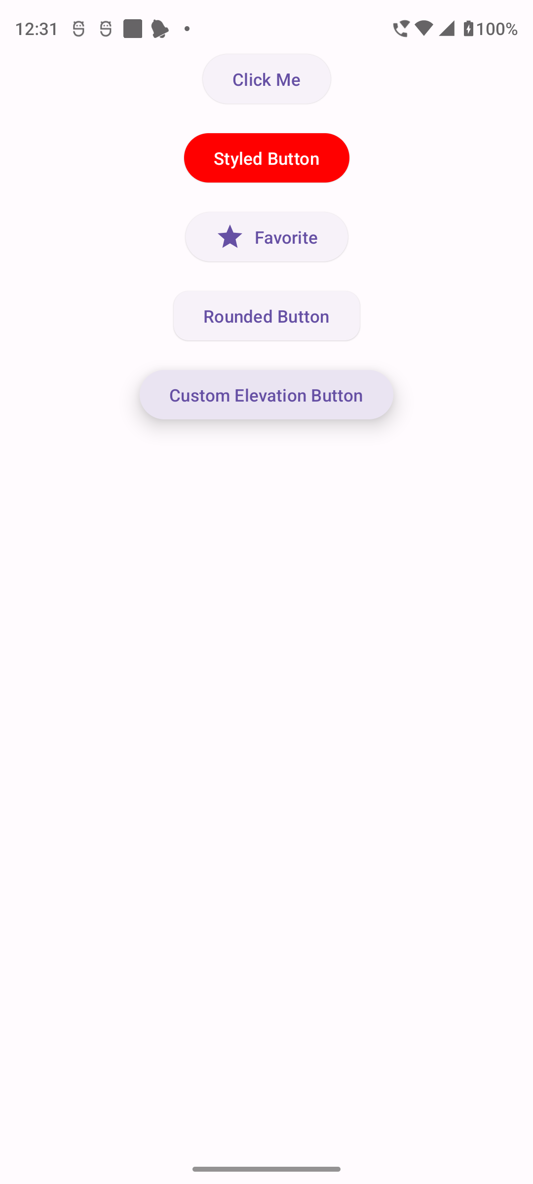
The ElevatedButton in Android Jetpack Compose is a versatile and powerful tool for creating visually distinct interactive elements in your app's user interface. Understanding how to customize and use ElevatedButtons effectively can enhance the usability and aesthetics of your Android applications.