


- 1HTML Forms
- 2HTML form Tag
- 3HTML Input Types
- 4HTML Labels and Placeholders
- 5HTML Select Dropdown
- 6HTML Checkbox
- 7HTML Radio Buttons
- 8HTML Textarea
- 9HTML Submit and Reset Buttons
- 10HTML Form Validation
- 11HTML Required Fields
- 12HTML Input Pattern Attribute
- 13HTML min and max Attribute
- 14HTML Form Action and Method
- 15HTML Fieldset and Legend
- 16HTML Form Advanced Controls
- 17HTML Date Picker
- 18HTML Range Slider
- 19HTML Color Picker
- 20HTML File Upload
- 21HTML Datalist
- 22HTML Autofocus and Autocomplete
HTML Input Types
text, email, password, number
HTML Input Types: Collecting Data the Right Way
Forms are the user’s voice on your website — and input fields are how you hear it. HTML offers a wide range of <input> types to collect everything from simple text to dates and files. Choosing the right type enhances both usability and validation.
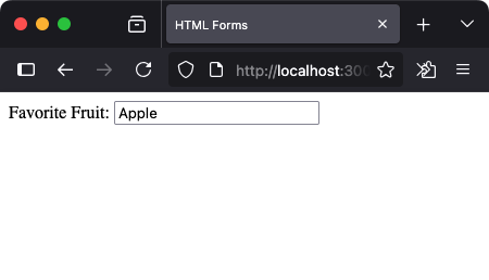
1. Text Input
This is the most basic input field, used to collect short single-line text like names, fruits, or cities.
<label for="fruit">Favorite Fruit:</label>
<input type="text" id="fruit" name="fruit" placeholder="Apple">
2. Password
This field hides user input behind dots or asterisks — perfect for login forms.
<label for="password">Password:</label>
<input type="password" id="password" name="password">
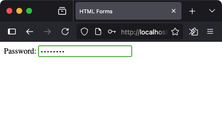
Though it hides the characters, remember — it's not encrypted. That happens on the backend.
3. Email
This input expects a properly formatted email address. Most browsers also trigger email-specific keyboards on mobile.
<label for="email">Email:</label>
<input type="email" id="email" name="email" placeholder="hello@example.com">
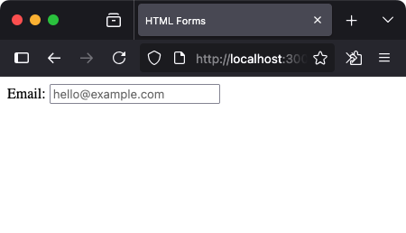
Try submitting the form with an invalid email, and you'll see the browser prevent it.
4. Number
Use this to accept numeric input only. You can also define minimum and maximum values.
<label for="quantity">Quantity:</label>
<input type="number" id="quantity" name="quantity" min="1" max="10">
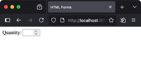

The up/down arrows help the user adjust the value easily.
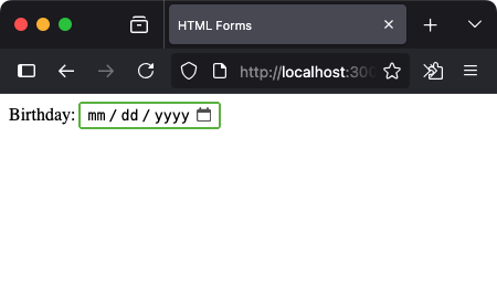
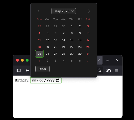
5. Date
The date input brings up a calendar picker — a user-friendly way to select a date.
<label for="birthday">Birthday:</label>
<input type="date" id="birthday" name="birthday">
6. File
Let users upload files from their device. Common for profile pictures or documents.
<label for="upload">Upload Image:</label>
<input type="file" id="upload" name="image">
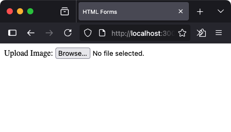
Remember to set enctype="multipart/form-data" in your form when handling file uploads.
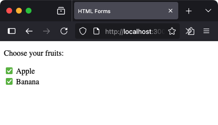
7. Checkbox
Checkboxes allow users to select multiple options from a group.
<p>Choose your fruits:</p>
<input type="checkbox" id="apple" name="fruit" value="apple">
<label for="apple">Apple</label>
<br>
<input type="checkbox" id="banana" name="fruit" value="banana">
<label for="banana">Banana</label>
8. Radio
Radio buttons let the user choose one — and only one — option from a group.
<p>Pick one:</p>
<input type="radio" id="cherry" name="vote" value="cherry">
<label for="cherry">Cherry</label>
<br>
<input type="radio" id="banana" name="vote" value="banana">
<label for="banana">Banana</label>
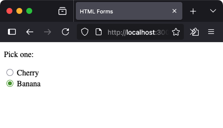
All radio inputs must share the same name to work together as a group.
9. Hidden
This input doesn’t show on the page, but it's useful for passing preset values during form submission.
<input type="hidden" name="source" value="signup-page">
It’s often used behind the scenes for tracking, context, or analytics.
10. Submit and Reset
<input type="submit" value="Submit">
<input type="reset" value="Clear">
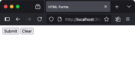
submit triggers form submission, and reset clears all fields.
Summary of Input Types
| Type | Description |
|---|---|
| text | Single-line text input |
| password | Hidden input for passwords |
| Validates email format | |
| number | Numeric input with range options |
| date | Calendar date picker |
| file | File selection from device |
| checkbox | Multiple selections allowed |
| radio | Single selection from a group |
| hidden | Invisible data passed with form |
| submit / reset | Trigger or reset the form |
Best Practices
- Use the right input type for better UX and native validation
- Add
nameattributes to ensure fields are submitted properly - Use
placeholderandlabeltogether for clarity and accessibility
Comments
Loading comments...